IQ.PL — brand identity
IQ.PL is a Polish hosting provider specializing in reliable hosting solutions, dedicated servers, and cloud services. With a strong emphasis on security, stability, and professional service, IQ.PL has been supporting businesses with cutting-edge hosting solutions for over two decades.
—
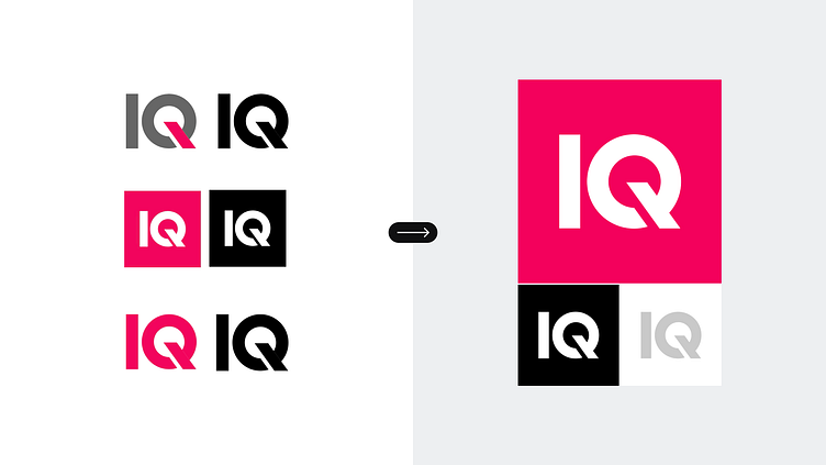
The objective of this project was to streamline and modernize the company’s visual communication and identity rather than creating a completely new one. The focus was on simplifying and standardizing the existing brand elements to ensure consistency and clarity.
Scope of work:
– Simplification, standardization and structural improvement of the existing logo.
– Brandbook with colors, typography and visual elements defined.
– Design of gadgets and identification materials.
– Social media templates.
– Print materials.
The logo underwent careful refinement to eliminate unnecessary variations and standardize the construction of the primary symbol, enhancing its clarity and usability across all formats and platforms. A minimalistic color scheme was introduced to reflect the company’s focus on technology and professionalism.
The palette focuses on magenta and blue, each chosen for its specific purpose.
Magenta represents energy and innovation, serving as the primary brand color to emphasize the company’s dynamic and forward-thinking approach.
Blue, on the other hand, is used exclusively for interactive elements, such as links and actionable areas, to enhance usability and guide user engagement. These colors were strategically selected to highlight IQ.PL’s technical expertise while ensuring a user-friendly and approachable experience.
The visual identity incorporates clean, geometric layouts with subtle diagonal accents inspired by the slant in the logo’s “Q.” These design elements create a cohesive and modern visual language that is applied consistently across all brand materials. The updated identity was designed to serve multiple functions, from corporate branding to HR purposes, ensuring flexibility for marketing materials, digital platforms, and recruitment campaigns.
This refined visual identity helps IQ.PL stand out in a competitive industry while remaining true to its core values of reliability, innovation, and customer focus. The result is a modernized and cohesive brand presence that supports both technical excellence and human connection.
—
If you’re looking to elevate your brand with a thoughtful and cohesive visual identity that aligns with your business goals, let’s work together. I’m here to help bring clarity, creativity, and consistency to your brand. Reach out to start your next project!


