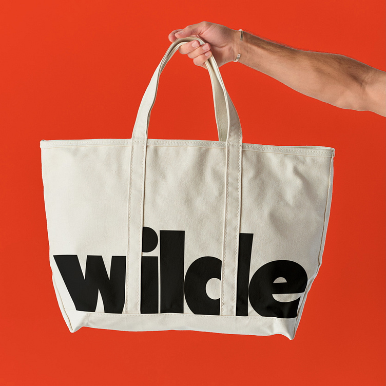
Wilde
What is Wilde?
Wilde is a contemporary bag label that specializes in offering versatile, stylish, and functional bags designed for everyday use. The brand wanted an identity that reflected its modern, bold approach while remaining simple and easily recognizable. The goal was to create a design that stood out in a competitive market while conveying both the durability and aesthetic appeal of the bags.
Project overview
The primary challenge was to establish a brand identity that communicated the essence of the Wilde brand: modernity, functionality, and boldness. The design needed to resonate with a broad, fashion-forward audience while maintaining an approachable, down-to-earth quality. The brand required a visual identity that could work across various touchpoints—from online presence to product labels and packaging—without becoming overly complicated or losing its core message.
The Approach
Bold Sans Serif Font
The choice of a bold sans serif font was pivotal in creating a strong, contemporary feel. This typeface is clean, modern, and highly legible, ensuring that the brand name stood out both in print and online. The sans serif letters also evoke a sense of simplicity, emphasizing the minimalistic yet confident aesthetic that Wilde embodies.
Color palette
The color scheme was chosen to align with the boldness of the font and logomark. A modern color palette of deep and neutral tones—such as black, navy, and rich burgundy—was selected to balance sophistication with energy. These colors were chosen to appeal to a broad audience while ensuring versatility across the product range and brand materials.
Logomark
The logomark was designed to be minimalistic, featuring geometric shapes that convey both strength and elegance. Its simplicity made the mark versatile, allowing it to be used across various applications such as bag hardware, packaging, and promotional materials. The design was intended to be easily recognizable, ensuring that the Wilde brand would stand out in both crowded retail spaces and online marketplaces.
Pattern
To further enhance Wilde's brand identity, a geometric pattern was incorporated into the design, adding depth and visual interest while maintaining the overall simplicity of the aesthetic. This pattern was inspired by the shapes and lines found in the construction of the bags themselves—clean, structured, and functional. The geometric elements subtly reflect the brand’s emphasis on durability and practicality while reinforcing its modern, bold approach. Used sparingly across packaging, promotional materials, and the website, the pattern complements the primary logo and typography, helping to establish a cohesive visual language that feels both contemporary and timeless. This pattern enhances the brand’s identity by providing an additional layer of recognition, elevating the overall aesthetic without overwhelming the design.
The simple logomark, bold typography, and limited color palette ensured a cohesive look across all touchpoints, which reinforces the brand's identity and helps it become memorable to consumers.
Outcome
The final design effectively solved Wilde’s branding challenge by establishing a strong, contemporary identity that stood out in a crowded market. The bold sans serif font communicated the modern, straightforward approach of the brand, while the simple logomark created an easily recognizable symbol. The use of bold colors reflected the boldness of the designs themselves, reinforcing the idea of Wilde bags as both functional and stylish.
The brand now has a clear visual identity that resonates with its target audience and stands the test of time. The minimalist yet impactful design positions Wilde as a modern label with timeless appeal, successfully bridging the gap between functionality and fashion.


