The Green Kitchen
Welcome to The Green Kitchen
The Green Kitchen is a salad bar concept offering customers the ability to craft their own unique salads from an array of fresh, customizable ingredients. With an emphasis on natural, wholesome ingredients and a fresh, modern approach to dining, The Green Kitchen aims to create a warm and inviting atmosphere for health-conscious individuals who value quality and customization.
Project Overview
The objective was to develop a visual identity that communicates The Green Kitchen's core values: freshness, customization, and a focus on healthy living. The brand needed to be versatile across various touchpoints, including signage, packaging, staff uniforms, and promotional materials. It also needed to capture the essence of natural ingredients while conveying a modern, elevated experience.
The problem this design resolved was the need for The Green Kitchen to differentiate itself in a crowded market of salad bars and customizable dining options. While many competitors offered similar services, the challenge was to create a brand identity that conveyed not only the freshness and health-conscious nature of the offerings but also a sense of sophistication and elevated dining. The design needed to communicate the customizable aspect of the menu, evoke feelings of natural ingredients, and position the restaurant as a modern, upscale yet approachable choice for customers seeking both quality and personalization.
A Fork in the Road to Freshness
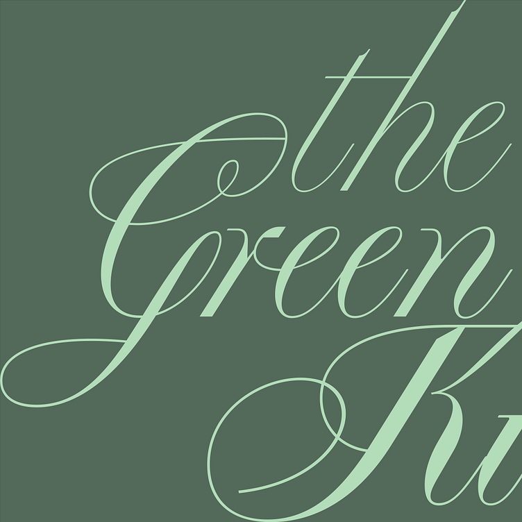
Wordmark
A calligraphic font was chosen for the wordmark to evoke a sense of sophistication and elegance, offering a classy vibe while remaining approachable. The flowing, organic lines of the font mirror the natural curves of fresh vegetables and the idea of customization.
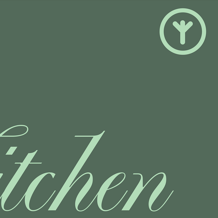
The logomark features a subtle yet modern abstraction of a vegetable stem intertwined with a fork. This symbol serves as a visual cue to the core elements of The Green Kitchen – vegetables and fresh ingredients – while being versatile enough for branding applications across different mediums.

Green with Envy
The color scheme was carefully selected to emphasize freshness and nature, focusing on various green hues to represent the wide range of vegetables and natural ingredients available at The Green Kitchen. A combination of light greens for freshness, dark greens for sophistication, and muted earth tones was incorporated to convey both vibrancy and warmth.
A Touch of Elegance
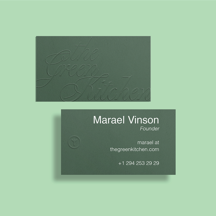
The business cards were designed with a premium, light feel. To enhance the natural, organic aesthetic, I used embossing for the logo to add a tactile dimension to the design. This subtle detail emphasizes the high-quality, thoughtful nature of the brand while maintaining a light, airy aesthetic.
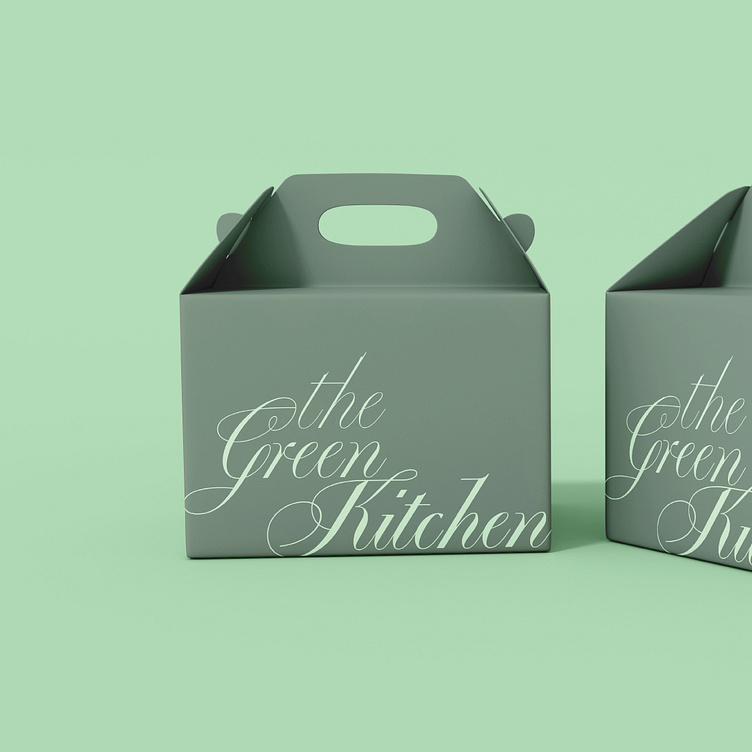
Fresh to Go
For take-out packaging, I wanted to create a seamless brand experience for customers. The packaging features the logo prominently, printed on sustainable materials to align with the Green Kitchen’s commitment to the environment. The design incorporates the logo mark and green tones, ensuring that the experience feels fresh and aligned with the brand values, even after the meal leaves the restaurant. The modern and minimalist style makes it clear that the food inside is high-quality and fresh.
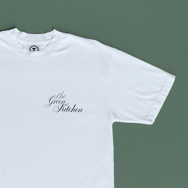
Dressed for Success
Staff uniforms were designed with comfort and style in mind. The uniforms include subtle green accents to align with the color palette- the elegant logo is embroidered on the chest. The clean design of the uniforms ensures they complement the modern, fresh aesthetic of the restaurant, without being overly formal.
Outcome
The branding for The Green Kitchen successfully creates a balanced blend of sophistication and freshness. The calligraphic logo evokes a sense of elegance while the modern logomark referencing vegetables and forks communicates the essence of healthy, customizable dining. The use of green hues ties everything together, making the brand feel both fresh and inviting.
The embossing on the business cards adds a tactile experience that reinforces the premium nature of the brand, while the take-out packaging and staff uniforms offer a cohesive, seamless brand experience from start to finish.
This branding has allowed The Green Kitchen to stand out in the competitive market of customizable food, creating a memorable and cohesive identity that resonates with health-conscious customers seeking high-quality, customizable meals in a welcoming and modern environment.
