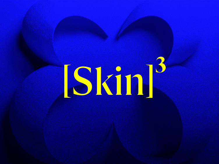
The essence of [Skin]³ – Logo & visual identity
This key visual embodies the essence of our [Skin]³ concept with bold typography, vibrant color contrasts, and flowing shapes that symbolize renewal and elasticity. The superscript "³" highlights the concept of triple benefits—hydration, smoothness, and strength—while the electric blue and yellow palette ensures a striking and modern brand presence. A tactile, petal-inspired background based on the "³" shape ties it all together, reinforcing the themes of vitality and rejuvenation.
Let's link up.
Ooho Agency | Website | LinkedIn | Info@ooho.io
Some of our services.
Animations | Branding | Illustrations | Logos | Marketing | Photography | Product design | UI/UX design | Webdesign | Web development
Oh! Don't forget to press that L button if you like what you see.
