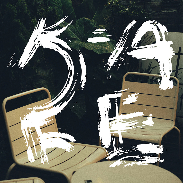
K-AFE
What is K-AFE?
K-AFE is more than a café; it is a celebration of Korean culture, blending tradition and modernity in every cup. The goal was to create a visual identity that reflects the café’s authentic roots while appealing to a contemporary audience. Inspired by hanji calligraphy strokes, the brand design emphasizes elegance, artistry, and the fluidity of Korean culture.
The Design Concept
Blending Tradition with Modern Elegance
K-AFE needed a distinctive and cohesive visual identity that blended modern design with traditional Korean elements, while also reflecting the café’s unique cultural heritage. The challenge was to create a brand that was sophisticated yet approachable, catering to a diverse audience while emphasizing the authenticity of the café's offerings.
The branding for K-AFE began with a deep exploration of Korean aesthetics. Hanji, the traditional Korean handmade paper, inspired the fluid, organic strokes in the logo mark and logotype. These elements symbolize craftsmanship and artistry, two qualities integral to the café’s philosophy.
The neutral color palette—soft creams, warm taupes, and muted grays—serves as a canvas, allowing the vibrant flavors of K-AFE’s curated drink selection to shine. This understated approach highlights the sophistication of the café experience, where every detail is intentional and harmonious.
Application Across Brand
K-AFE’s visual identity seamlessly translates across all brand assets, creating a cohesive and immersive experience:
Menu Design
Minimalist layouts paired with drink illustrations make the menu both functional and visually appealing.
Stationery
Office materials, including letterheads and business cards, extend the brand’s elegance to corporate communications.
Packaging
Cups, sleeves, and takeaway bags feature the hanji-inspired logo, reinforcing brand recognition.
Bringing the Menu to Life with Graphics and Photography
K-AFE’s menu design merges the artisanal with the scientific, creating a visually engaging experience. Each drink is accompanied by a dynamic mix of graphics and photography, highlighting its unique qualities. Hand-drawn arrows and diagram-like details lend a subtle scientific vibe, emphasizing the care and precision behind every recipe.
The high-quality photographs showcase the vibrant colors and textures of the beverages, while the graphic overlays add character and context. This blend of art and science not only enhances the aesthetic appeal of the menu but also invites customers to explore the craftsmanship behind each drink, making the selection process both intuitive and inspiring.
Elevating Stationery Design
K-AFE’s stationery collection was designed to reflect the brand’s artistry and refined aesthetic. Each piece, from business cards to envelopes, incorporates subtle nods to Korean traditions. The hanji-inspired strokes feature prominently, lending a handcrafted feel to the designs, while the neutral color palette ensures a clean, professional appearance.
Special attention was given to tactile elements—textured paper and embossed details enhance the sensory experience, mirroring the café’s emphasis on quality and attention to detail. Whether used for customer communication or internal operations, the stationery elevates every interaction, leaving a lasting impression of K-AFE’s thoughtful identity.
Harmony of Tradition and Creativity
K-AFE’s branding embodies a balance between tradition and modernity. The hanji-inspired strokes honor the café’s roots, while the bespoke graphics and thoughtful applications speak to its contemporary vision. Each design element works together to create a refined, artistic identity that mirrors K-AFE’s commitment to quality and cultural authenticity.
Outcome
The design solution involved a handwritten logo inspired by traditional hanji calligraphy, paired with minimalist, neutral-toned elements that allowed the café’s vibrant drink selection to take center stage. Custom illustrations and a scientific-style graphic for the menu enhanced the connection between the brand's artistic values and its carefully curated beverage offerings.
This branding not only resolved the need for a visually cohesive identity across all touchpoints—from packaging to menu design—but also highlighted K-AFE’s dedication to blending tradition with contemporary design, making it stand out in a competitive market.


