The Beauty of Glass morphism in Design
The Beauty of Glass morphism in Design
Glass morphism is a modern design trend combining transparency, blur, and depth to mimic the look of frosted glass. It’s sleek, clean, and versatile, making it a favorite for UI/UX and digital graphics.
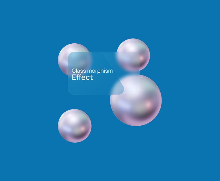
In my latest design, I used a semi-transparent glass panel layered over a vibrant blue background, paired with 3D metallic spheres for depth. The result? A modern, eye-catching aesthetic that balances simplicity with sophistication.
Why does glass morphism work?
It draws attention to key elements, communicates elegance, and aligns with contemporary design trends. From UI interfaces to social media graphics, this style enhances any project. It’s a trend worth trying!
What do you think about this approach? Have you tried glass morphism in your designs? Let’s connect and share ideas!
