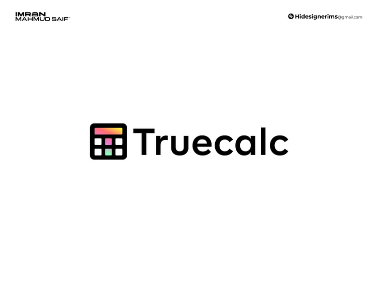
Modern and Minimal Logo Design for Truecalc
TrueCalc logo, I crafted a design that seamlessly combines functionality with brand identity. The logo takes the form of a calculator, instantly recognizable to users, while subtly incorporating the letter "T" within the shape to represent TrueCalc. I focused on a clean, modern aesthetic, using minimalist typography to enhance the logo’s precision and intelligence, aligning with the app’s AI-driven capabilities. This approach not only creates a memorable brand mark but also reflects TrueCalc’s mission to deliver smart, accessible calculations for everyone.
More by Imran Mahmud Saif ™ View profile
Like
