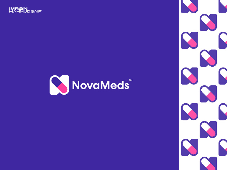
Combination Logo design for Nova Meds
Nova Meds logo, I used the letter "N" as the central shape, incorporating a tablet capsule within it to symbolize the platform’s focus on online healthcare. The design features a modern color combination, creating a fresh, dynamic look that stands out. The clean typeface complements the logo, ensuring it’s professional and easily recognizable. This approach reflects Nova Meds’ commitment to providing accessible, reliable online medication services with a modern, trustworthy identity.
More by Imran Mahmud Saif ™ View profile
Like
