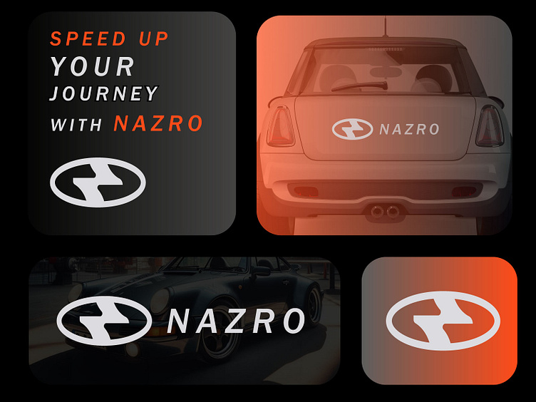
NZ Letter Car Company Logo Design
NZ Letter Nazro Car Company Logo Design
Client Overview
Company Name: Nazro Car Company
Industry: Automotive
Target Audience: Car enthusiasts, buyers, and luxury automotive stakeholders.
Objective: Create a modern, sleek, and memorable logo using the letters "NZ" to represent Nazro, capturing the brand's values of innovation, speed, and premium quality.
Project Brief
Nazro Car Company required a distinctive logo featuring the initials "NZ." The design needed to:
Embody speed, precision, and elegance.
Appeal to a global audience, emphasizing luxury and technological advancement.
Adapt well to diverse branding materials such as vehicle badges, marketing collateral, and digital platforms.
Design Process
1. Research and Discovery
Brand Analysis: Focused on positioning Nazro as a futuristic and high-performance brand.
Market Study: Analyzed logos of competitors like Tesla, BMW, and Lexus for inspiration while ensuring differentiation.
Symbolism: Explored themes such as motion, sophistication, and cutting-edge design.
2. Concept Development
Initial Sketches: Created 20+ sketches, experimenting with dynamic lines, abstract forms, and sleek typography.
Inspiration:
Speed and Motion: Curved lines and diagonal slants to evoke acceleration.
Precision: Geometric structures that highlight technological sophistication.
Luxury: Minimalist and premium design aesthetics.
3. Design Execution
Typography:
Custom-designed "NZ" with sharp, futuristic round for a high-tech look.
Bold, clean font for the full company name to ensure legibility at various scales.
Iconography:
Integrated a Oval element within the "Z" and "N" to symbolize motion and speed.
The "N" was stylized with a metallic effect to suggest durability and strength.
Color Palette:
Chrome Silver: Represents innovation and high performance.
Deep Black: Signifies luxury and elegance.
Orange Accents: Adds a futuristic and tech-savvy feel.
Shapes: Kept the overall design Oval and dynamic, avoiding hard line shape to maintain a modern and soft aesthetic.
4. Feedback and Iteration
Presented three design concepts:
Minimalist "NZ" in monochrome with sharp, industrial edges.
A dynamic "NZ" integrated with a racing stripe and a bold italic typeface.
Abstract "NZ" monogram with gradient metallic effects for a luxury appeal.
Chosen Concept: The third option resonated the most with stakeholders for its premium look and adaptability.
Final Design
The finalized logo features an abstract "NZ" monogram in chrome silver with a subtle gradient, paired with an electric blue swoosh accent within the "Z." The company name "Nazro" is positioned below in a bold sans-serif typeface, ensuring clarity and balance.
Results
Recognition: The logo garnered attention during its launch, praised for its modern and luxurious appeal.
Versatility: Successfully adapted to vehicle branding, including hood ornaments, steering wheels, and marketing materials.
Brand Alignment: Effectively communicates Nazro's values of speed, innovation, and premium quality.
Conclusion
The NZ letter logo design helped position Nazro Car Company as a leader in the luxury automotive market, reflecting its commitment to performance and technological advancement. This sleek and versatile design ensures the brand’s longevity in a competitive industry.
