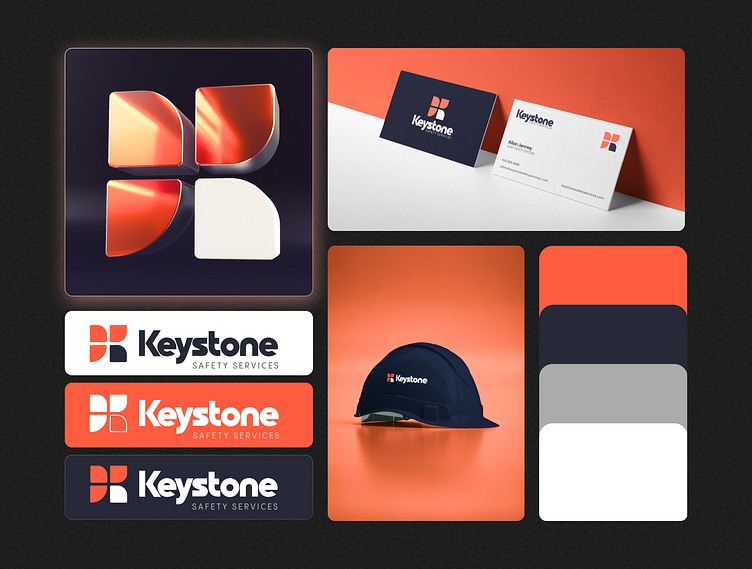
Keystone Safety Services - Brand Design
Building trust through bold design choices. For this EHS consulting firm's visual identity, we chose a dynamic coral palette that commands attention while maintaining professionalism.
The logo mark features four curved quadrants creating a protective shield motif, with three segments in varying coral tones and one in white for balance. This geometric approach symbolizes both strength and accessibility – key values for a safety services provider.
The color system extends beautifully across their brand touchpoints, from business cards to safety equipment. The vibrant coral acts as a beacon of visibility – fitting for a company dedicated to workplace safety and compliance.
The dark navy serves as a grounding complement, adding authority to the overall identity while ensuring the brand remains versatile across applications.
