Neva's Salsa Branding
NEW WORK! ✨ Developing a brand’s vibe is one of my favorite parts of my job. I love getting to work with clients who are launching a fresh product. 🥳 Getting the branding right straight out of the gate is so important in establishing the brand awareness in the customers mind. You don’t want to be changing it fresh out of the gate and create brand confusion in the marketplace.
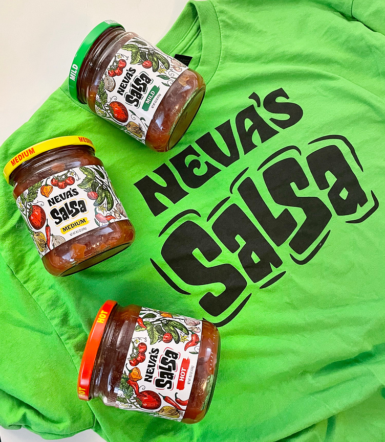
Neva’s Noodles, known for their homemade egg noodles since 1961, is growing their product line with Neva’s Sweet Salsa! The project began with establishing a logo as a sub brand under Neva’s that could stand on its own and have the savory look and jazz that the salsa brings. TRUST ME, this salsa is delicious! 🤤The noodle skus have an old fashioned look to the packaging, and we wanted to grab a slightly different target audience for the salsa. With so many competitors on the shelf, we knew we wanted something hand illustrated that showed the craftsmanship and organic ingredients picked fresh for the salsa. Unlike the photography used on competitors labels, ours has a hand drawn original look that is timeless for years to come.
This style of illustration was a delight to bring to life on the labels. Each of the 3 skus have quick recognition and brand presence on the shelf with their distinctive colors of green, yellow and red representing mild, medium and hot. As the labels progress to hot, the illustration changes with slight additions to the peppers.
Hand lettering by Jeremy Friend.
Hoot Design Studio
Illustration • Branding • Label & Packaging Design
www.hootdesignstudio.com | Follow along on Instagram
LET'S WORK TOGETHER
Email: Jen@hootdesignstudio.com

