Singularity Finance Identity Design

Singularity Finance Cover

Overview

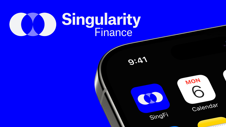
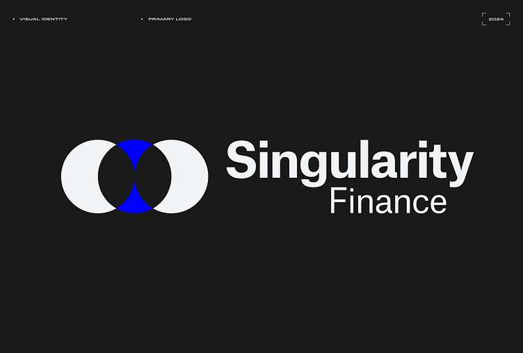
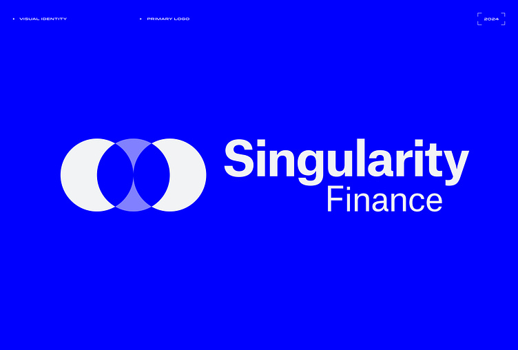
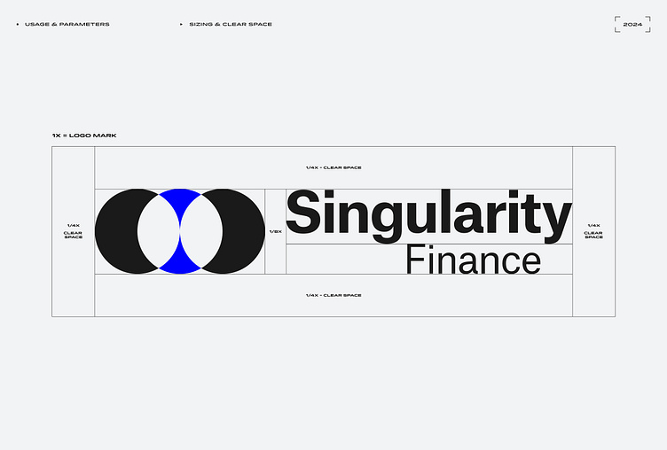
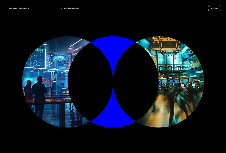
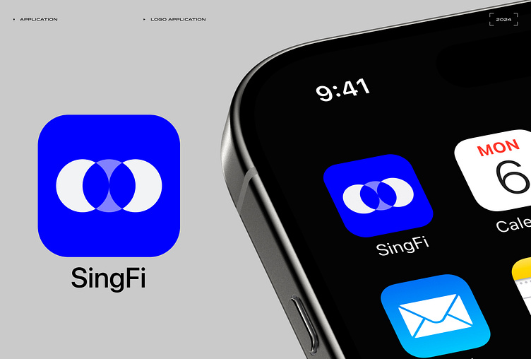
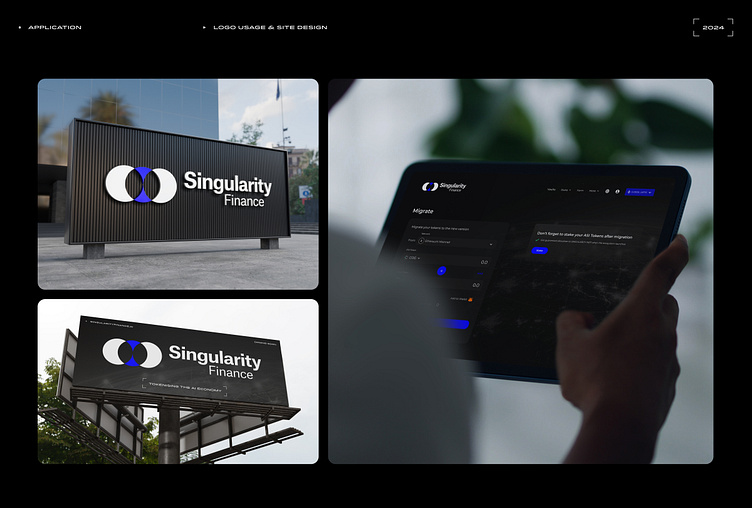
This concept was developed for a client project, where the objective was to create a brand identity symbolising the token merger of three distinct companies. The design brief also called for a connection to the theme of the singularity, encapsulating the convergence and unity of these entities. To achieve this, I employed a minimalist design approach, drawing inspiration from the established visual language of traditional finance and venture capital firms.The result is a minimalist design that blends modernity with the stability of traditional finance, while subtly reflecting the concept of singularity.

Singularity Finance logo with overlapping circles, a blue center, and bold black sans-serif text
Singularity Finance logo with overlapping circles, a blue center, and bold white sans-serif text
Singularity Finance logo clear space guide with proportions marked around the logo elements
Three overlapping circles with images inside, representing technology, data, and people
Colour palette featuring primary and secondary hues with HEX and CMYK codes
Atlas Grotesk typeface family, showcasing font variations for design reference
Sample text in various sizes and weights, demonstrating font usage for website design
Visual representation using a dot scale, showing brand perception on various traits
Singularity Finance logo adapted for iOS and Android app icons
Logo and website design across various platforms

✦ Turn your vision into reality with bold branding and seamless UX/UI ✦

📧 tom.mellonie@gmail.com

✦ All Rights Reserved © Tom Mellonie Design (TMD)

More by Tom Mellonie Design

View profile