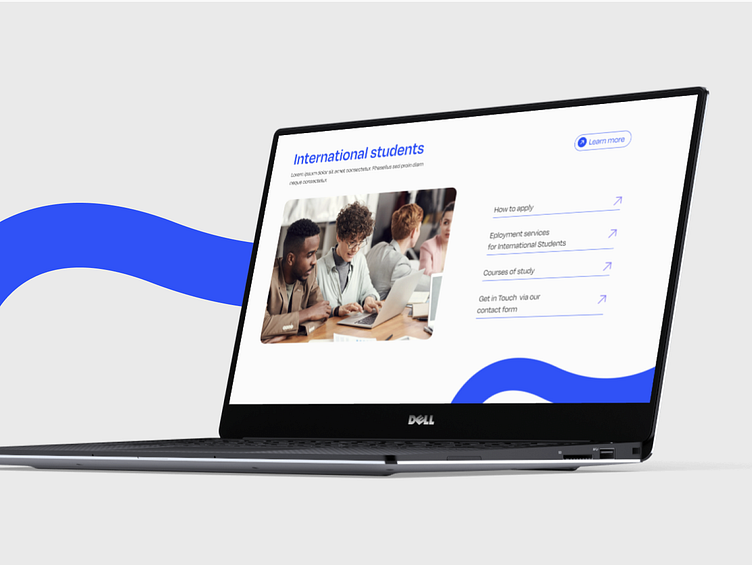
✨ A Fresh Take on University page for students
Hi Everyone 👋🏻
🚀 Excited to share a new perspective on our landing page design!
This project celebrates students and Latvia as a cultural hub at the heart of Europe. The design brings a modern, clean aesthetic that feels approachable and inspiring.
We’ve paired a light, minimalist layout with vibrant color accents to create a dynamic and youthful vibe. Rounded shapes and candid photos of students in their everyday surroundings add a sense of warmth and authenticity, making the page feel personal and relatable.
Every element is carefully crafted to emphasize accessibility and connection, ensuring users feel welcome and engaged.
Let us know what you think—we’d love to hear your thoughts! 💬
Share your challenges with us - together we will create solutions to attract users!
Contact us now 💬hello@kreatik.pl
Let’s connect:


