Neobrutalism Design
Collaborate Across the World: Neobrutalism Web Design for ConnectTeams
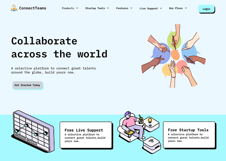
Excited to share my latest project—a neobrutalist web design crafted for ConnectTeams, a platform designed to connect talents globally and foster collaboration. This design aims to balance bold aesthetics with intuitive functionality, creating an engaging yet professional experience for users.
Design Goals
✔️ Create a visually striking layout inspired by neobrutalism.
✔️ Emphasize collaboration and inclusivity through visuals and structure.
✔️ Ensure a user-friendly experience with a clear hierarchy and intuitive navigation.
Key Features!!
💡Minimalist Aesthetic
Inspired by neobrutalism, the design uses bold typography, flat illustrations, and vibrant colors while maintaining simplicity and clarity.
🤝 Collaboration-Focused Graphics
The central illustration—a circle of hands—represents unity and global teamwork, reinforcing the platform’s purpose.
🔗 Clear Call-to-Actions
Strategically placed buttons like "Get Started Today" and "Our Plans" encourage user engagement while standing out in the layout.
🖌️ Playful Yet Professional Illustrations
Custom graphics in the lower section add personality and highlight key features like live support and startup tools.
What Do You Think?
This was an exciting exploration of combining bold design trends with practical UI/UX principles.
I'd love to hear your thoughts—feedback, suggestions, or just some love! ❤️
Let me know how you feel about the balance of style and usability in this design. Let’s discuss in the comments!
#WebDesign #Neobrutalism #UIDesign #CollaborationPlatform #Dribbble
