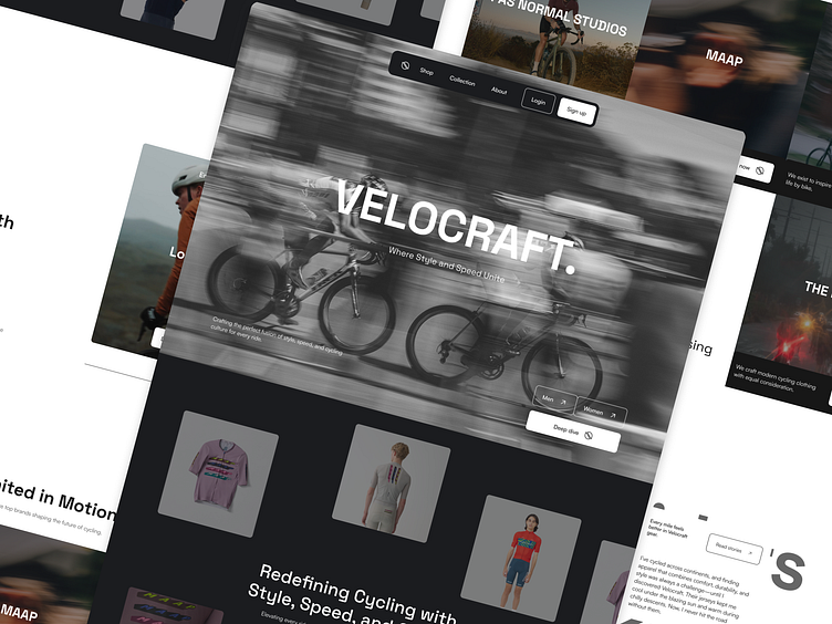
VELOCRAFT - Apparel Store Landing Page
Hi Overtime Designers 🦸♂️
Nice to meet you all!✨
So today, we will be sharing a project exploration, which involves creating a website for VELOCRAFT. The goal of this website is not just for exploration, you can check out the project overview below!
We’ve just completed a stunning landing page design for VELOCRAFT, an e-commerce platform specializing in luxury cycling apparel. The goal? To bring a fresh, modern look that elevates the shopping experience and positions VELOCRAFT as a pioneer in Indonesia’s cycling community.
Key Challenges:
Generic Market Presence: Many cycling apparel websites lacked distinctiveness, blending into the crowd with similiar layouts and design.
Unclear Categorization: Product classifications were mixed and unorganized, making it hard for users to find what they needed.
Outdated Aesthethic: Competitor websites relied on traditional, uninspiring designs that didn't appeal to modern buyers.
Lack of Luxury Focus: No platform in Indonesia exclusively catered to high-end cycling brands.
Limitied Users Engagement: Websites lacked interactive elements to create an engaging shopping journey.
What We Did:
Modern & Clean Redesign: Introduced a fresh, minimalist look with sleek typography and bold visuals to captivate users at first glance.
Focused Categorization: Organized collections by product type and cycling needs for an intuitive shopping experience.
Luxury Appeal: Created a premium feel with curated designs and exclusive brand highlights to elevate VELOCRAFT as a pioneer.
Enhanced Engagement: Integrated interactive features and promo codes to keep users connected and motivated to explore.
The section we love most🧑🏽🎨
Panning love shot from: Pas Normal Studios & MAAP
Appreciated for attention 🙌🏽
If you want to see a more complete range of products or collaborate on future large-scale projects, hit me up on @ssamakerja2123@gmail.com


