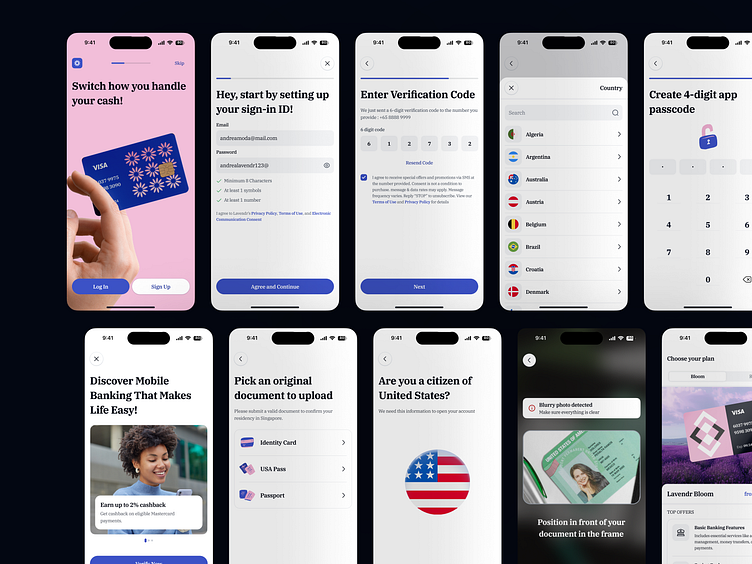
Lavendr - Onboarding Mobile Bank App
Overview
Lavendr’s onboarding section is designed as a user-centric flow that prioritizes ease of use, accessibility, and trust-building. The focus is on creating a delightful first impression with a balance of intuitive design and essential functionality. Every touchpoint is crafted to guide users through registration, verification, and setup in a way that feels seamless, engaging, and secure.
Challenges
User Flow Optimization: Avoiding friction points in the onboarding journey while ensuring all steps are necessary and logically sequenced.
Engagement vs. Simplicity: Balancing clean, minimal interfaces with engaging elements to keep users motivated to complete onboarding.
Responsive Design: Ensuring a consistent experience across devices, screen sizes, and orientations.
Onboarding Fatigue: Managing user attention spans by breaking down tasks into digestible steps and avoiding information overload.
Trust Building: Communicating security measures (e.g., SSL badges, KYC disclaimers) without intimidating or overwhelming users.
Results
Optimized User Flow: Improved task completion rates due to intuitive navigation and logical sequencing.
Higher Retention Rates: Reduced drop-offs thanks to a visually appealing and engaging experience with progress tracking and contextual help.
Improved Accessibility: Positive feedback from a diverse user base, ensuring inclusivity for users with varying abilities and tech literacy.
Consistency in Experience: Responsive design and adaptive layout ensured smooth onboarding across different devices.
Trust and Confidence: Enhanced transparency through friendly copywriting, clear security messaging, and error prevention mechanisms boosted user confidence.
Mockup
Let's collaborate with us
🛍️ Download our Premium UI Kit on
Follow our pages and join the journey
Instagram | LinkedIn | Behance


