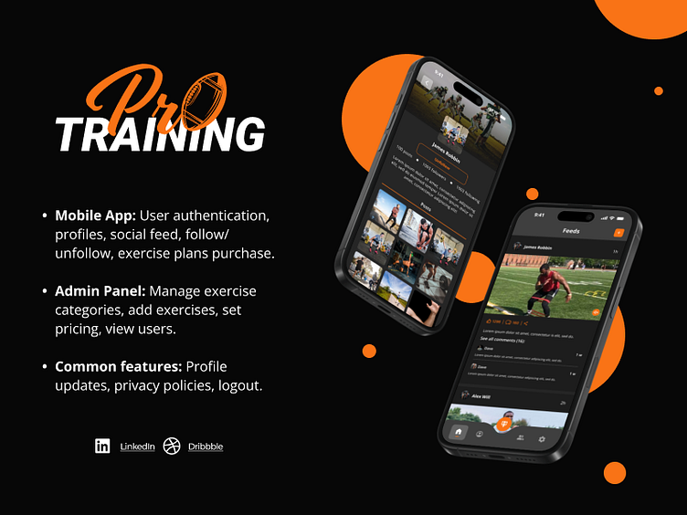
Mobile Fitness Application - ProTraining
Brief Overview
This project revolves around designing a fitness-focused mobile application and admin panel. The app empowers users to explore exercises, follow fitness influencers, share their fitness journey, and purchase personalized exercise plans. The admin panel supports streamlined management of exercises and pricing. Designed with user-centricity, the app caters to fitness enthusiasts and administrators alike.
Style Guide
1. Font:
Open Sans: Chosen for its modern and clean aesthetics, Open Sans enhances readability across all devices. Its versatility ensures that both titles and body text remain legible and professional, aligning with the app's focus on clarity.
2. Colors:
#F97316 (Vibrant Orange): Represents energy, activity, and motivation—key elements of fitness.
#262626 & #3F3F3F (Dark Greys): Provide a sophisticated and non-intrusive background that enhances focus on content.
3. Dark Mode Theme:
Dark mode was chosen to reduce eye strain and battery consumption, especially for users who engage with the app during workouts or in low-light environments. The dark theme complements the vibrant accent colors, making the design visually appealing and functional.
Core Features
Mobile Application:
Authentication: Signup, login, and password recovery.
User Engagement: Create and explore user profiles, follow/unfollow functionality, and feed interactions (like, comment, share).
Content Sharing: Upload fitness feeds with images and videos.
Exercise Plans: Browse and purchase plans with tiered information access.
Utility Features: Profile updates, privacy settings, and logout options.
Admin Panel:
Management Tools: Authentication, exercise category creation, exercise listing by category, and pricing setup.
User Oversight: Manage a list of users.
Standard Features: Profile updates and password management.
Final Thoughts
This fitness application reflects a perfect balance of aesthetics and functionality, tailored for modern fitness enthusiasts. By leveraging a dark mode theme with energetic color accents, the design not only enhances usability but also reinforces the app's dynamic and motivational ethos.


