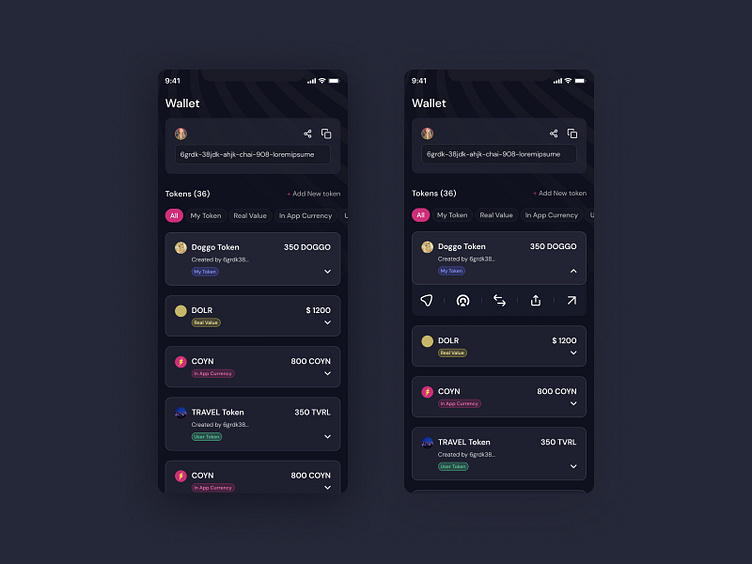
Wallet Redesign | Dark Mode Interface
I’m excited to share a wallet redesign concept for ICPUMP.fun! The design features a sleek, dark mode UI with a focus on clarity and ease of use. The wallet interface is structured around expandable token cards, each providing quick access to detailed information and multiple token-related functions.
The goal was to create a clean and intuitive experience, making it easy for users to manage their tokens while offering a visually engaging and efficient layout.
What do you think of the dark mode look?
More by Malvika Rautela View profile
Like
