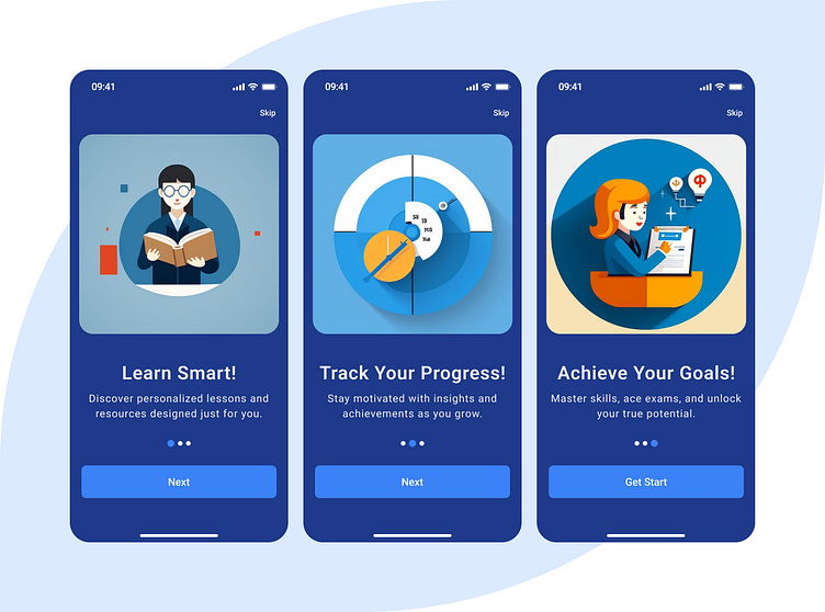
Educational App Onboarding Screens
Design Breakdown: Educational App Onboarding Screens
Theme & Color Palette
Gradients: Blue and light blue gradients create a serene, motivating atmosphere, promoting focus and reliability—essential qualities for an educational app.
Emotional Impact: The palette instills trust and concentration while subtle bright accents provide energy and draw attention to key features.
Visual Elements
First Screen: Knowledge & Education
Decorative Touches: Abstract shapes, like swirls or dots, add movement and vibrancy without compromising clarity.
Purpose: To emphasize education as the foundation of the app’s purpose, encouraging users to begin their journey confidently.
Second Screen: Growth & Progress
Decorative Elements: Subtle, geometric designs enhance the professional yet approachable aesthetic.
Purpose: To highlight how the app helps users track their growth and reach their learning objectives visually and engagingly
Third Screen: Success & Achievement
Playful Professionalism: It balances an engaging design with an air of credibility appealing to students and professionals.
Purpose: To inspire users with the possibilities the app unlocks, building excitement and anticipation for the journey ahead.
Navigation Features
Progress Dots: These dots at the bottom visually represent the onboarding flow’s progression, enhancing user orientation and motivation to complete the setup.
Buttons:
Skip (Top-Right): A convenient option for users who want to bypass onboarding, respecting their time.
Next/Get Started (Bottom): Prominently placed and accessible, guiding users effortlessly through the onboarding flow.
Purpose & Ideal Use Cases
This design framework suits:
E-Learning Platforms: Engages users immediately with its motivational and user-focused design.
Test Preparation Apps: The visuals and progression charts reinforce goal-oriented learning.
Skill Enhancement Apps: Professional yet playful aesthetics appeal to learners and upskillers.
The onboarding screens create a user-friendly introduction that motivates learners to engage deeply with the app by merging intuitive navigation, inspiring visuals, and a calming color palette.

