Daily UI #018 -Analytics Chart
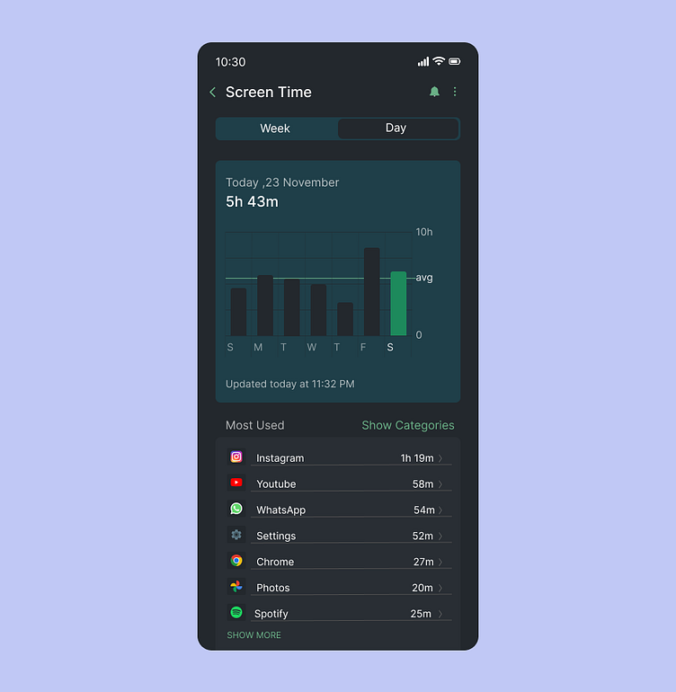
The Analytics Chart on screen usage timings presents a clean, visually appealing layout to track device usage. It features interactive graphs such as bar and lines , showcasing daily or weekly usage patterns. The color-coded segments make it easy to distinguish between different activities. Users can click over different bars detailed insights and comparisons. The design is intuitive, with a minimalist approach to enhance clarity and user engagement.
