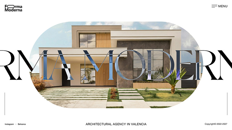
Forma Moderna - Hero Section
I designed this hero section for an architecture agency based in Valencia, focusing on clean lines, modern typography, and a minimalist layout to reflect the agency's contemporary aesthetic. The bold overlapping text integrates seamlessly with the featured architecture, creating a dynamic yet sophisticated visual.
The circular frame draws attention to the central design, while the neutral palette keeps it professional and timeless. Let me know your thoughts or how you’d approach this design!
Connect with me:
LinkedIn | Instagram | Behance | Facebook
Like the design? Spread your love. Support me with a Like ❤️
More by Bogdan Kolomiyets View profile
Like
