Servantes Atelier - Furniture / Brand Identity
Servantes Atelier is a leading company specializing in the creation of unsurpassed kitchens and cabinetry. Our team of craftsmen has many years of experience and skill in this field, thanks to which we are able to satisfy the needs and wishes of our customers. Servantes Atelier is known for its individual approach, use of high-quality materials, and aesthetic design that transforms kitchens and furniture into masterpieces of style and functionality.
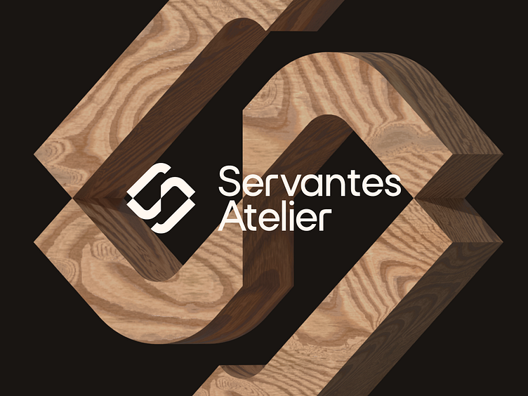
The task is to create a minimalist logo that is easy to remember. Which combines three metaphors in the form of the letter "S" shelves, and a screw. Which will convey the idea of assembling cabinet furniture.
The letters (R, T, and E) were also rewritten for uniqueness and combination with the logo.
Corporate colors, purple and black, chosen because they symbolize individuality and minimalism, are best used on a black background.
The font we have chosen is called "Archive", and it rightfully deserves its versatility and practicality. Thanks to its variety of thicknesses, it is an ideal choice for graphic design, websites, signage, corporate identity, and editorial design.


