Greenify Mobile App
Design Breakdown: Greenify App
Theme & Color Palette
Since sustainability is promoted, a green-themed palette would best be appropriate.
The light green serves as the background while the dark green acts as a highlight therefore promoting aesthetics.
Visuals
Splash Screen:
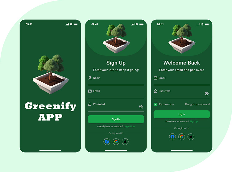
Illustration: A minimal white pot holds a bonsai, a tree known for growth, care, and the urge to be eco-friendly.
Due to the centralized design, the tree becomes part of the brand as it is the most important aspect designed to complement the identity of the brand.
Sign-Up Screens:
Header Illustration: The bonsai tree is used again and is consistent for branding purposes.
Usability is also maintained with ample input fields for name, email, and password.
The bright green shade of the sign-up button fits the theme but still pops to assist in grabbing attention.
Login Screen:
Header Illustration: More of the same bonsai for consistency’s sake.
Usability is enhanced with functional options including ‘remember me’ and ‘forgot password’.
Login through Google, Facebook, and Apple accounts have been designed as options that are few and identifiable.
Navigation
Form fields are accompanied by subtle instructions so that they remain uncluttered.
The interfaces for logging in and signing up are easy to find and use.
Purpose
This design is suitable for:
Applications that aim to encourage users to take initiatives like achieving zero waste or planting more trees.
Any organization with a primary focus on environmental and sustainable development.

