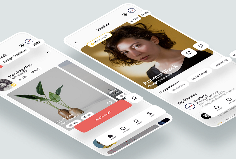
Application Design - School graduate
About this project
The application is inspired by the bento design style, with a clear and modular interface, combining the codes of social networks such as Behance, LinkedIn and Facebook.
It offers a neat presentation of student portfolios and facilitates interactions between users.
Dark Mode
The application's dark mode uses a balanced color palette: black and bluish gray to limit visual fatigue, orange-red to energize and emphasize interactions, and white for marked contrasts. This colorscale, prepared in advance, guarantees navigation that is both fluid and immersive, highlighting the key elements of the interface.
Colorscale
The app uses a palette of orange-red, black, white and gray with a slight bluish tint. This choice of colors provides contrast, readability and a balance between warmth and sobriety.
Certification
In order to have an active community, a gamification system has been integrated into the application. To do this, the user must be active in order to earn points and obtain a certification badge, which provides visibility on the home page.
Thanks for watching
Follow me for more design inspiration


