TRAVEL WEBSITE
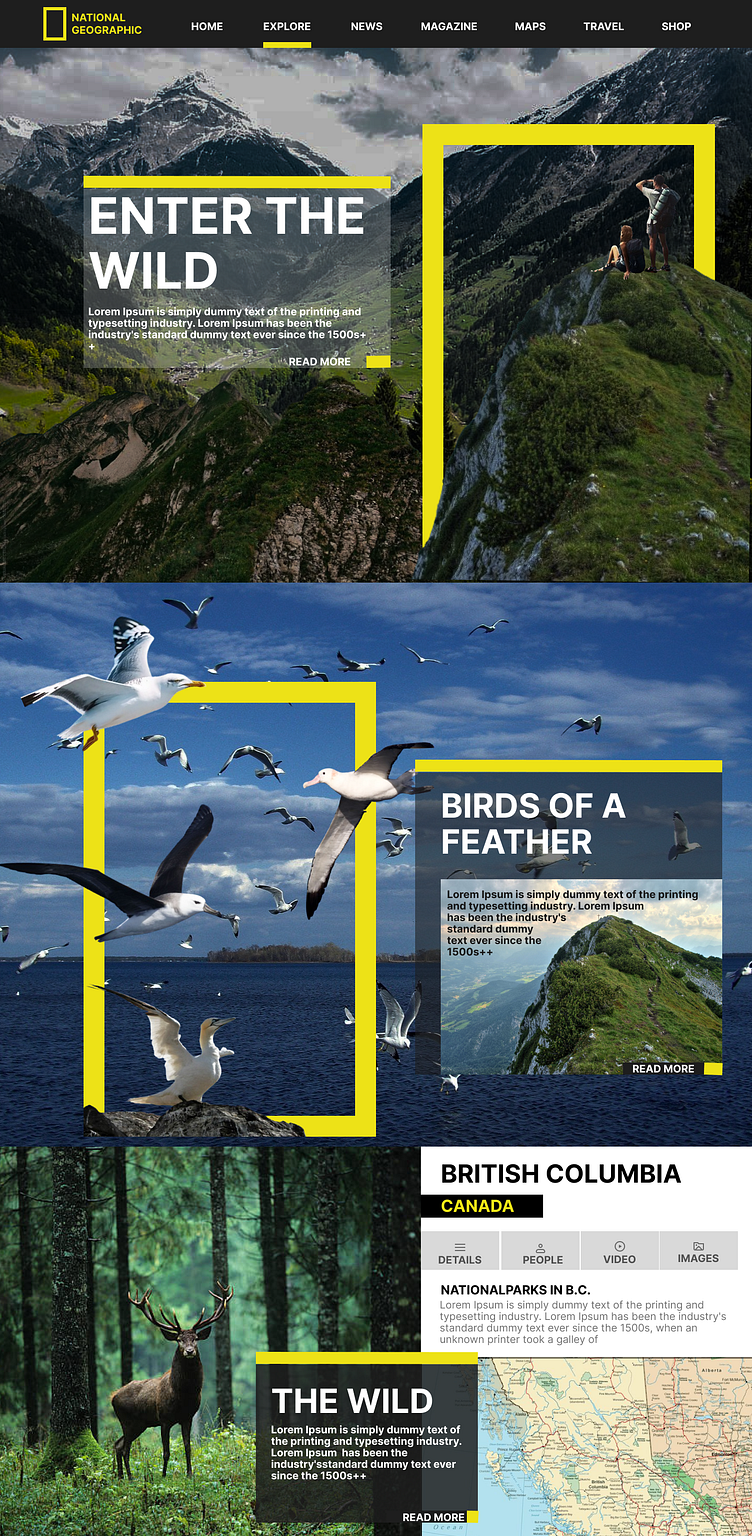
I design showcases a visually striking layout inspired by National Geographic's branding, emphasizing nature's beauty and exploration. Here's a breakdown of your design process and structure:
1. Header Section:
Logo and Navigation:
Positioned the National Geographic logo prominently on the top left for brand recognition.
Created a clean horizontal navigation bar with menu items like Home, Explore, News, Magazine, etc., ensuring easy access to key pages.
Used a highlighted underline for the selected menu option (e.g., Explore) to provide clear visual feedback.
2. Hero Section:
Imagery and Typography:
Featured a large scenic background image of mountains and valleys to immediately immerse the user in nature.
Overlaid a semi-transparent text box with bold typography for the title, "ENTER THE WILD," complemented by a short description.
Yellow Borders:
Incorporated distinctive yellow frames around parts of the image to echo National Geographic's iconic color and create a dynamic focus.
3. Content Highlights:
Birds of a Feather Section:
Designed a section featuring birds in flight over the ocean, maintaining the theme of wildlife and exploration.
Used overlapping yellow frames and floating bird imagery to create depth and motion.
Included another semi-transparent text box for a title and description, ensuring readability.
4. Detailed Information Section:
British Columbia Overview:
Dedicated a section to British Columbia, featuring a mix of visual and textual elements.
Structured the content with tabs (Details, People, Video, Images) to organize information in an interactive and user-friendly way.
Kept the focus on the location by highlighting it in bold yellow and white typography.
5. Footer Highlight:
Wildlife and Map Section:
Added a visual block featuring a forest with a deer to convey wilderness.
Included a map graphic in the layout to provide geographical context, making it functional as well as aesthetic.
Used a yellow-highlighted text overlay for consistency with the rest of the design.
6. Color Palette and Typography:
Color Scheme:
Balanced black, white, and yellow for a modern and professional look while staying true to National Geographic's branding.
Typography:
Used bold sans-serif fonts for titles and clear, readable text for descriptions to maintain visual hierarchy.
7. Interaction and User Experience:
Incorporated hover effects (indicated by Read More buttons and highlighted tabs) to invite user interaction.
Organized the layout with clear sections, ensuring a seamless browsing experience.
