Mobile App Onboarding Screen
Design Breakdown
Theme & Color Palette:
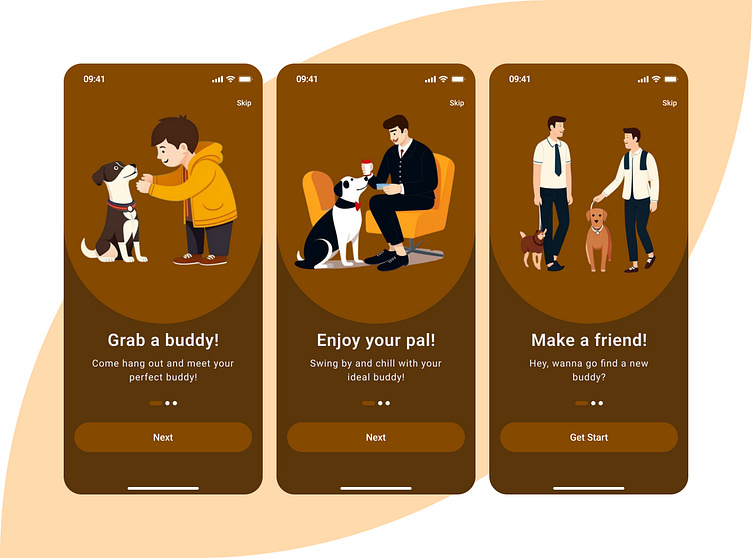
The brown and orange colors give an overall inviting impression that fits well into every theme such as companionship, friendliness, and pet care.
Visuals:
All the screens have characters that are well-drawn and interact with pets on them. This makes the images to be effective and of a focused warmth.
Illustrations are generally round because they fit the color scheme and keep the design current.
Content:
First Screen:
Title: Grab a buddy!
Subtitle: Come and let me introduce you to your perfect buddy!
Second Screen:
Title: Have fun with your pal!
Subtitle: Come over and relax with your perfect buddy!
Third Screen:
Title: Be Friends!
Subtitle: Hey, do you want to get a new buddy?
Navigation:
Users can visually measure how much they have completed the onboarding steps thanks to a progress indicator at the bottom.
There are two buttons, `` Skip` and ``Next,` which are placed in a very clear and simple-to-understand manner.
Purpose:
This design would be appropriate for the apps related to:
Finding, socializing, or training your pets.
A space where users can meet for assistance and help each other with chores such as walking their dogs or looking after them.

