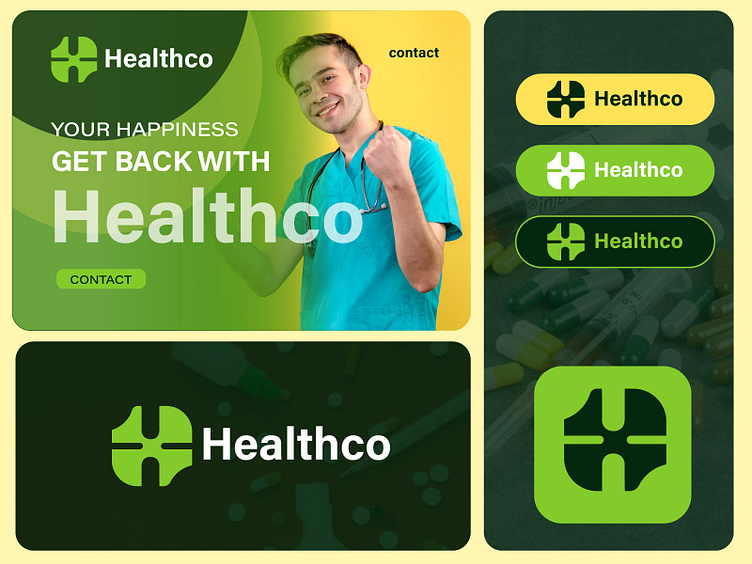
H Letter Medical company logo design
HealthCo Medical Care is a modern healthcare provider focusing on holistic, patient-centric medical services. The brand seeks to convey trust, care, and innovation while maintaining a connection to nature and wellness.
Design Objective: Create a memorable and versatile logo centered around the letter H, incorporating organic shapes and a green color scheme. The logo should symbolize health, growth, and connection to nature.
Design Process
1. Understanding the Brand
HealthCo’s core values emphasize:
Trust & Reliability: As a healthcare provider, trust is paramount.
Holistic Care: A focus on overall well-being, not just treatment.
Natural Connection: A commitment to sustainable and organic practices.
2. Research & Inspiration
The exploration phase involved studying:
The use of monograms in healthcare branding.
Organic shapes found in nature, such as leaves, waves, and spirals.
Green color palettes, associated with life, health, and sustainability.
3. Concept Development
Sketching Ideas
Initial sketches revolved around:
Abstract "H" forms blending natural elements like leaves or vines.
Circular or flowing designs symbolizing unity and growth.
Clean, geometric lines to maintain a professional appearance.
Digital Prototyping
Several concepts were digitized, narrowing down to one key design:
The H Core: A bold, modern "H" as the focal point.
Organic Elements: Integrated flowing lines and leaf-like forms to evoke growth and care.
Symmetry: Balanced shapes to represent stability and trustworthiness.
4. Final Design
The chosen logo features:
Central “H”: A clean and geometric letterform that anchors the design.
Organic Curves: Soft, flowing lines form a leaf-like pattern around the H, symbolizing holistic care and nature.
Green Palette: A gradient of greens, transitioning from deep emerald to light mint, conveys vitality and healing.
Color Palette
Deep Green (#007F4F): Represents trust and stability.
Leaf Green (#3DBE75): Symbolizes growth and wellness.
Mint Green (#DFF5E0): Adds a fresh, modern feel.
Typography
Font: A sans-serif typeface was chosen to complement the logo, reinforcing a clean and approachable aesthetic.
Applications
The logo was designed to be versatile across multiple platforms:
Signage: Maintains clarity even at large scales.
Digital Use: Optimized for websites, social media, and mobile apps.
Print Collateral: Appears sharp and professional on brochures, business cards, and medical reports.
Impact
The HealthCo logo successfully:
Established a strong visual identity aligned with the brand’s values.
Enhanced brand recognition with its memorable monogram design.
Conveyed a professional yet approachable image, resonating with patients and partners alike.
Mockups and Examples
Business cards featuring the green gradient logo.
A mobile app splash screen with the monogram glowing subtly.
Clinic signage with the organic H design prominently displayed.
Conclusion The HealthCo logo reflects the essence of holistic care, blending modernity with nature. Its organic shapes and green color scheme communicate a message of health, trust, and growth, ensuring the brand’s identity is both memorable and meaningful.
Unused Concept.
Available for sale $$$
CONTACT FOR FREELANCE WORKS :
Email:alimdesignsbd@gmail.com
Contact for design advice:
