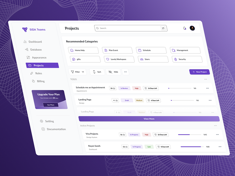
Dashboard (Rayan Sazeh)
Hello everyone!
I’m excited to share my latest design project—a dashboard created for the company Rayan Sazeh. This project was developed to address several key challenges identified by the client:
- Difficulty in selecting workspaces
- Lack of visibility for the active plan
- Settings being scattered across multiple sections
- An inconvenient entry point for accessing and managing the workspace list
- Suboptimal user and access management pages
Considering these challenges, the final design was crafted to solve each issue effectively. Key features of the redesigned dashboard include:
+ A dedicated space to showcase recently used workspaces for quicker access
+ A specific section for active plans, ensuring visibility at all times
+ Advanced filtering options for streamlined access to settings
+ Categorized and organized lists to make navigation intuitive and efficient for users
+ A prominent and easily accessible button for managing user permissions and access
This design prioritizes both functionality and user experience, ensuring that all user pain points are effectively addressed while maintaining a clean and modern interface.
Your feedback and thoughts are always appreciated!

