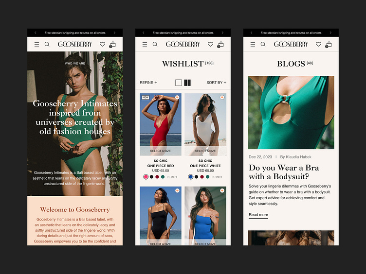
Gooseberry Redesign Mobile Screens
For Gooseberry’s mobile redesign, we focused on creating a flexible and user-friendly experience that enhances the shopping journey without compromising the brand’s luxurious aesthetic. Collection pages now offer the option to toggle between one- or two-column views, giving users more control over how they browse. Model size dropdowns provide easy access to fit information, while Quick Add functionality streamlines the path to purchase. Additionally, we designed mobile-friendly blog pages to ensure Gooseberry’s voice and expertise remain accessible on every device. This redesign brings elegance and functionality together, no matter where customers shop.
View the Full Case Study on Behance here
About Prismfly
Driving revenue for eCommerce brands through conversion rate optimization, full-stack development, branding, UI/UX design, and lifecycle marketing services.
learn more at www.prismfly.com
or reach us directly at contact@prismfly.com
