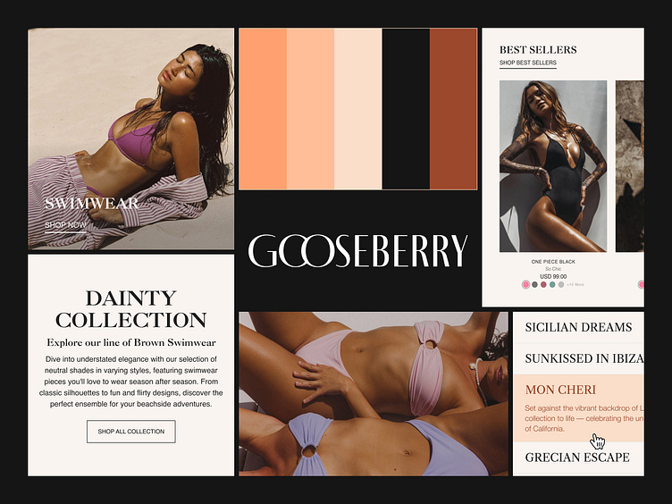
Gooseberry Branding Bento Grid
Gooseberry, a premium lingerie and swimsuit brand, needed a site redesign aimed at overhauling their online shopping experience. Our goal was to create a seamless, visually engaging platform that complemented the brand's aesthetic.
To create a solid foundation for the redesign, we revamped Gooseberry's color palette and typography first. The refreshed palette brings a sophisticated balance of soft, romantic tones (shown in the grid) and modern neutrals, perfectly aligning with the brand's identity. Updated typography combines elegance and readability, adding to the site's polished aesthetic while maintaining functionality across all devices. Together, these elements set the stage for a shopping experience that is both visually stunning and effortlessly intuitive.
View the Full Case Study on Behance here
About Prismfly
Driving revenue for eCommerce brands through conversion rate optimization, full-stack development, branding, UI/UX design, and lifecycle marketing services.
learn more at www.prismfly.com
or reach us directly at contact@prismfly.com
