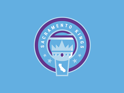
Sacramento Kings, primary logo
Just a little personal project that's been going down recently. Not a fan of the Kings logo or branding at all. It all seems lifeless and drab, and when you look at it compared to a lot of the logos in the NBA, it is really starting to get dated.
And guess what, it is looking like the Kings are getting a new logo for next season! I wanted to put my spin on it before those are unveiled.
Looked back on the kings history and decided that the OLD light blue combined with the NEW purple direction could be a fun and unique mash up of eras. Take that idea, mix it with the NBA trend of roundel primary logos, and you end up with something like this! So far, that is, as I want to improve it.
Crown imagery is more obvious, i tried to be more subtle with the "S" shape in purple in the middle, and for some reason, put some gradients in there, idk on that one. State of california is the final element, the shape it is in is very loosely based on bball netting.
Secondary logo is almost done at the moment, let me know what you think of this one tho :)


