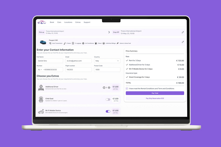
Car Rental Booking UX / UI
UX Case Study: Car Rental Booking Interface
Objective:The goal of this user interface is to facilitate a seamless car rental booking experience, ensuring users can input necessary details, select additional services, and understand the pricing breakdown easily.
Visual Design
Minimalistic Layout: The interface uses a clean, minimalistic design with ample white space, ensuring focus remains on essential elements.
Color Coding: Light purple accents are used for buttons, toggles, and highlights, creating a visually consistent theme.
Icons: Intuitive icons accompany text for better comprehension (e.g., car features, extras like child seats and Wi-Fi).
Typography: Clear, sans-serif font with well-differentiated sizes for headings, body text, and labels improves readability.
Information Architecture
Step-by-Step Process: The layout divides the booking process into logical sections:
Pickup/Dropoff Details: Displays dates, times, and locations.
Car Details: Highlights key features (e.g., transmission type, fuel type, capacity).
Contact Information: A straightforward form for user details.
Extras Selection: Optional add-ons, including additional driver, Wi-Fi, and child seats.
Price Summary: Transparent breakdown of costs.
Horizontal Navigation Bar: Clearly labeled tabs like “Book,” “Cars,” and “Extras” improve navigation..
Usability
Interactive Elements:
Quantity Adjusters: Increment/decrement buttons (+/-) for selecting the number of add-ons.
Toggles: For quick on/off selection of extras like Wi-Fi.
Error Prevention: Dropdown menus and formatted fields (e.g., phone numbers and postal codes) reduce input errors.
Responsiveness: Designed with adaptability for mobile and desktop users
Transparency in Pricing
Real-Time Updates: Changes to extras dynamically reflect in the total cost, avoiding hidden fees.
Price Breakdown: Clearly categorized costs (base rate, extras, insurance) help users understand the final total.
Payment Options: Offers flexibility with "Pay Total" or "Pay Only Reservation.
Accessibility
Real-Time Updates: Changes to extras dynamically reflect in the total cost, avoiding hidden fees.
Price Breakdown: Clearly categorized costs (base rate, extras, insurance) help users understand the final total.
Payment Options: Offers flexibility with "Pay Total" or "Pay Only Reservation.
Strengths
User-Centric Design: Simplifies a potentially complex booking process with logical segmentation.
Transparency: Offers clear and detailed information at every step.
Personalization: Allows users to customize their rental experience by selecting extras.
Conclusion
This UI balances simplicity and functionality effectively, guiding users through the car rental booking process with minimal friction.


