Interface – Serious Game
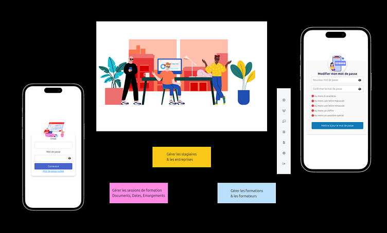
I’m excited to share a sneak peek of a password change interface I designed for an internal training platform built as a serious game. ✨
Vibrant colors to engage and captivate
The choice of vibrant colors was intentional: it reflects the playful and immersive universe of the serious game while making a traditionally dull task (changing a password) more engaging and visually appealing. The goal was to maintain consistency with the overall user experience, even in functional elements.
User experience in every detail
I wanted to ensure the user feels guided at every step with a clean and intuitive interface. Here’s how I approached it:
Clear password rules are prominently displayed (e.g., required length, uppercase letters, special characters like @, #, $, etc.).
A real-time password strength indicator encourages secure practices by showing users how robust their password is as they type.
Error and confirmation messages are straightforward, non-intrusive, and aligned with the platform's overall aesthetics.
Why focus on this screen?
Even something as simple as a password change deserves thoughtful design. In this space, every interaction—no matter how functional—should contribute to a seamless and cohesive user experience. For me, it’s about turning a potentially frustrating moment into a smooth and engaging interaction.
I hope this approach resonates with you! Let me know what you think—I’d love to hear your feedback. 😊
