CRO Landing page
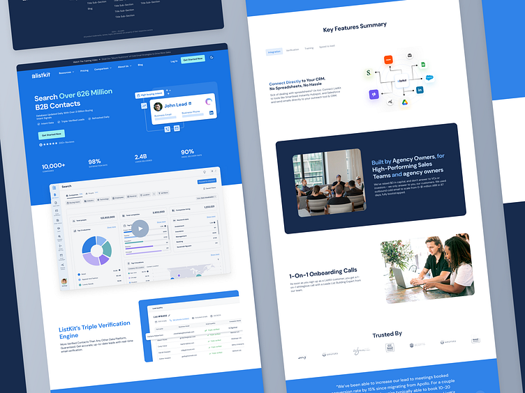
The goal was to improve the landing page’s ability to capture and convert visitors into users. The redesigned page combines clear messaging, trust-building elements, and an engaging layout to maximize conversions.
Clear Value Proposition:
Headline highlights the size of the database (“Over 626 Million B2B Contacts”) to immediately communicate the product's scale.
Supporting details like "21 Billion Buying Intent Signals" and "Triple-Verified Leads" reinforce credibility.
Strong Visual Hierarchy:
Large, prominent CTA buttons (“Get Started Now”) are placed in strategic locations for maximum visibility.
Key stats (10,000+ companies, 98% satisfaction rate, 90% email delivery rate) are visually emphasized to build trust and authority.
Interactive Visuals:
The example of "John Lead" with data points (email, phone, LinkedIn) visually represents the product's functionality, making it easier for users to understand what they will get.
Social Proof:
200+ reviews and high delivery stats serve as evidence of reliability and effectiveness.
User testimonials and trusted stats are strategically placed to address potential buyer skepticism.
Work with us
UserActive is a product design agency for B2B SaaS. We’re on a mission to help SaaS Founders create meaningful products users love.
Book a call 👉🏼 www.useractive.io
