Mark Riley Advisory Rebrand
Mark Riley Advisory. World Leaders in advanced technology solutions.
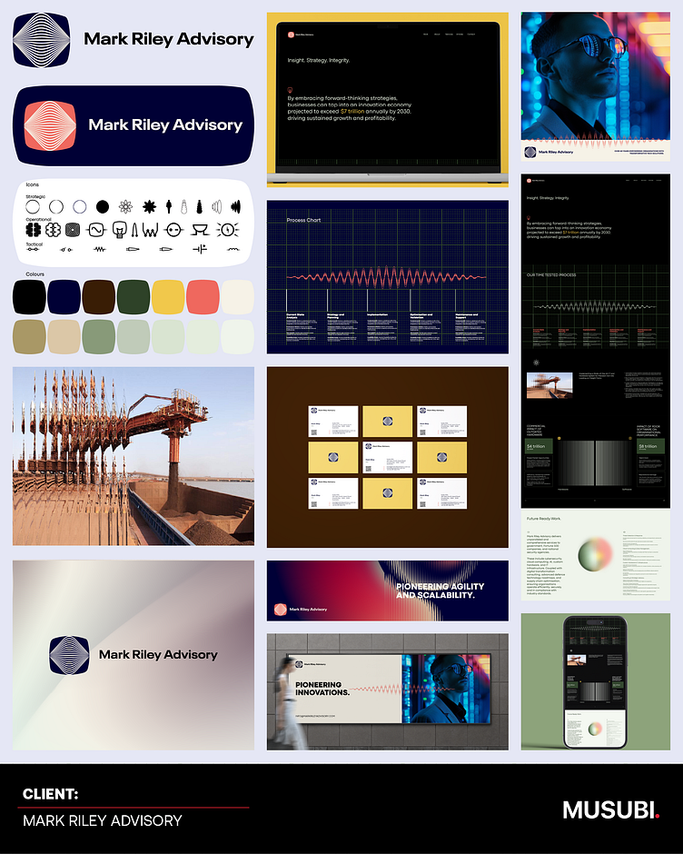
The brand showcase for Mark Riley Advisory is visually positions the firm to strategically align with their reputation as true leaders in advanced technology services.
Logo and Iconography:
The logo's fluid lines and modern aesthetic convey technological precision and innovation. It effectively resonates with a future-oriented brand narrative.
The modernist icons are consistent and versatile, visually supporting the diverse services offered.
Color Palette:
The use of deep blues and muted tones suggests trust, stability, and sophistication—qualities crucial for attracting government and Fortune 500 clients.
Accents of brighter colors (such as burnt orange and yellow) introduce a dynamic edge, reflecting forward-thinking and adaptability.
Typography and Layouts:
Clean, sans-serif typography ensures readability and professionalism.
The modernist systematic grid layout creates a strong, organized structure, which aligns well with the brand's emphasis on efficiency and precision.
Messaging:
There are two key positioning statement - "Pioneering Innovations" and "Agility and Scalability" to succinctly articulate their value proposition and emphasizes the brand’s relevance in global markets.
Visuals and Data Integration:
The charts, waveforms, and graphs establish credibility and technical expertise while reinforcing the advisory's data-driven approach.
Application Across Mediums:
Showcasing applications on websites, mobile interfaces, and physical billboards demonstrates the brand's adaptability to various communication platforms.


