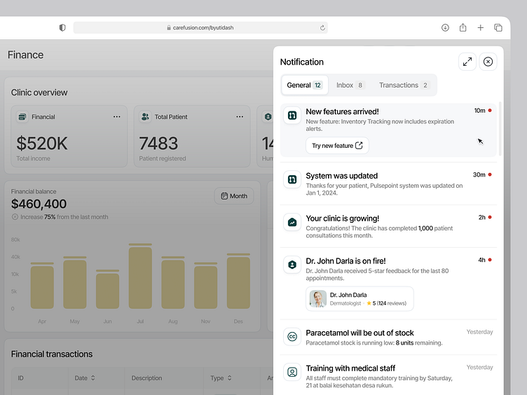
Carefusion - SaaS for Clinic Management (Flyout Notification)
Enhancing Notification Design for Better User Experience
I’m excited to share a new design concept for the notification flyout in a clinic management platform! Managing a clinic involves dealing with a wide range of updates, from appointment confirmations and system alerts to financial transactions and doctor communications. To ensure a seamless user experience, the notifications are categorized into General, Inbox, and Transactions, making it easier for users to prioritize what’s most important.
Here’s the thought process behind the design:
🔹 General: Focuses on system updates, new features, and general reminders.
🔹 Inbox: Centralizes communication, such as messages from staff or feedback from doctors.
🔹 Transactions: Highlights financial updates like payment confirmations or pending invoices.
This structured approach not only improves accessibility but also reduces information overload, helping users stay organized while managing their clinic.
Tab menus variant
Thanks for scrolling till the end🔥
Excited for new opportunity!
Let's have a chat!
↪︎ Email at emirabiyyu.hire@gmail.com or send me message
Reach me out at


