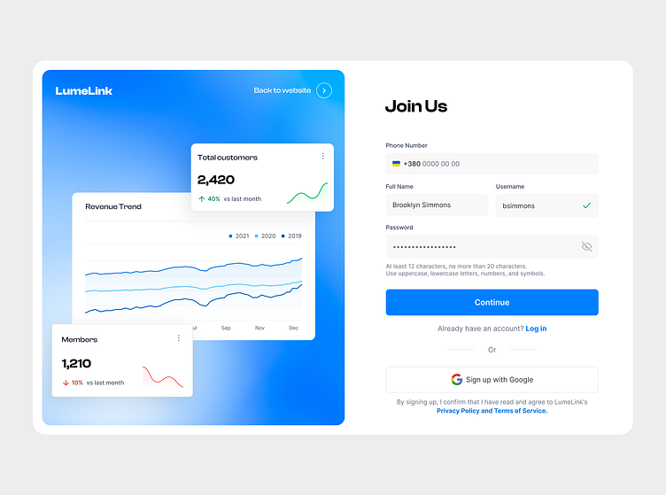
Web Sing Up Screen Page
This split sign-up page pairs a clean form with a visually engaging product showcase. The left panel highlights key metrics and trends, building trust and interest, while the right panel provides essential fields, clear instructions, and a Google sign-up option for convenience. The design ensures accessibility, usability, and a seamless registration experience.
More by NightNight | UI/UX Team View profile
Like

