Quantive Rebrand
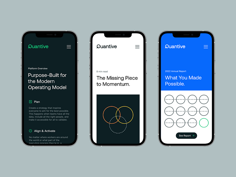
The Quantive color palette leads with a confident green that commands feelings of energy and performance. A dark neutral blue and a cool gray play a minimal and dynamic supporting role. We reinforced the minimalist, lightweight mindset with Aeonik — a workhorse font whose rigid shape feels bold and timeless.
Echoing the logotype keeps things streamlined and carries the branded Q throughout communications. Expressive type allows the brand to create simple, typographic visuals inspired by ideas around scalability, agility, momentum, and configurability.
A conceptual and abstract illustration style allows Quantive to articulate ideas and enables the brand to be more flexible through iconic lines and shapes. Iconography adds a subtle layer to support content, further expanding on the minimalist visual language.
Looking for a brand agency? We would love to hear from you.
Email us: hello@focuslab.agency

