Plumair – Interactive Air Quality Visualization 🌬️
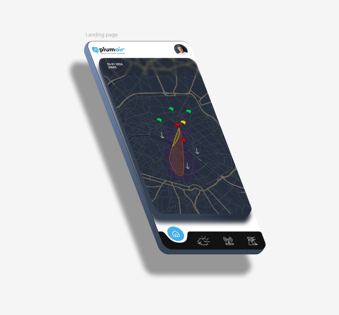
This design showcases a sleek and modern mobile interface for tracking real-time air quality.
🌀 Concept: The interactive map provides a detailed visualization of pollution flows and zones, with color-coded indicators signaling air quality levels (green, yellow, red). Arrows represent airflow directions, offering users a dynamic understanding of environmental data.
🎨 Design:
Dark palette: Perfect for highlighting interactive elements and the colorful zones on the map.
Minimalist iconography: At the bottom of the screen, simple icons allow intuitive navigation between core features (home, weather, network, settings).
3D perspective: Adds a modern, immersive effect, drawing users into the experience.
🌍 Goal: Deliver a clear and visually appealing solution to raise awareness about air quality issues while helping users better understand their environment in real time.
What do you think? Would this type of interface be useful for visualizing data? ✨
#UIDesign #DataVisualization #AirQuality #MobileDesign


