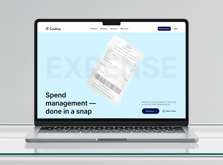
Coutisa - Website Of Simplified Expenses
Client's Request
Concur sought a website redesign to simplify their platform’s presentation and improve the customer experience. They wanted to emphasize efficiency and clarity in showcasing their expense and travel management solutions.
About the Project
The project aimed to create a clean, professional design that enhances usability and focuses on Concur’s core functionalities. It was essential to highlight their all-in-one platform for expense, travel, and invoice management.
Result
The redesigned website now delivers a sleek and efficient user experience. It effectively communicates Concur’s value proposition and improves accessibility across all devices.
Thanks for Watching!
Don't forget to press L or love button if you like it.
More by Marta Semylit View profile
Like


