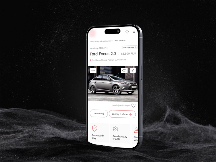
User-Centered Homepage Design for a Car Dealer
Hi Everyone 👋🏻
Excited to share our latest design project! 🚀
For this project, we worked on creating a user-friendly, clean, and modern homepage for a dealer of new and used cars. The main goal was to ensure the site delivers clarity and ease of navigation while drawing attention to the key elements that drive user engagement.
We kept things simple by using a subtle color palette consisting of black, white, and shades of gray. This gave the entire site a neat and sophisticated look. By using the brand's color for important elements like action buttons and headlines, we ensured the user could easily identify the next steps in their journey, whether that’s exploring cars or engaging with services.
The site’s interactive features are clearly highlighted, allowing users to easily browse and access the information they need without any distractions.
Take a look at the design, and as always, feel free to share your thoughts—your feedback means a lot! 💬
The site’s interactive features are clearly highlighted, allowing users to easily browse and access the information they need without any distractions.
Take a look at the design, and as always, feel free to share your thoughts—your feedback means a lot! 💬
Share your challenges with us - together we will create solutions to attract users!
Contact us now 💬hello@kreatik.pl
Let’s connect:


