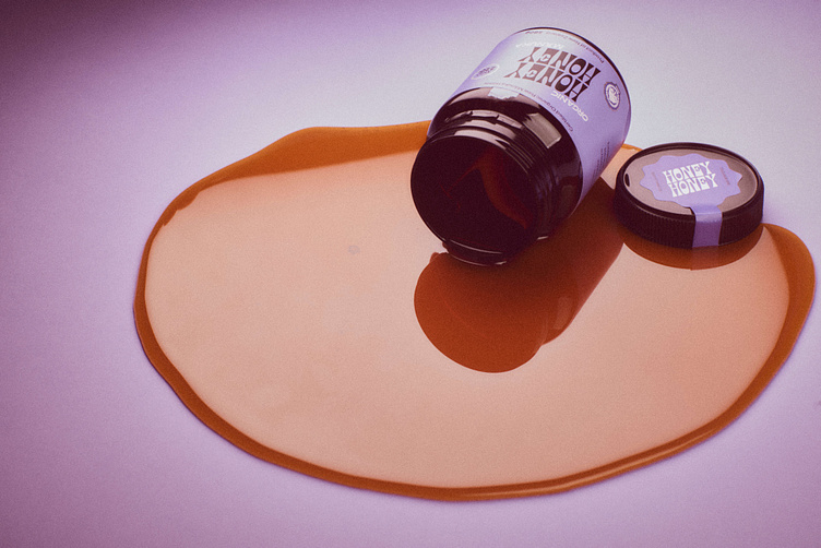
Honey Honey
Manuka honey brands are as common as sheep in New Zealand, so we knew Honey Honey had to be different. Typically, manuka honey brands are very clean and very professional, doing all they can to highlight the health benefits of their product. Our challenge was to emphasise the product’s obvious quality, but do so in a completely new, bold, buoyant way.
Purple, was our starting point, and thankfully it stuck. The logo, copy, and label design all reflected this cheerful feeling, and the analog imagery photography provided a sense of authenticity. The final result: a manuka honey brand that looked like no other.
More by Dialog Studio View profile
Like


