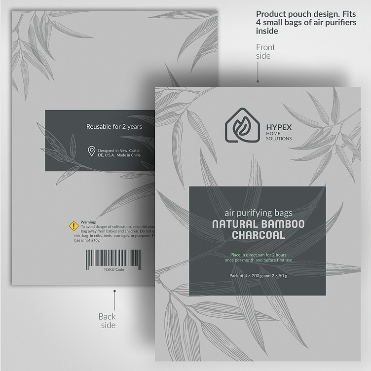
Hypex: logo / brending / packeging
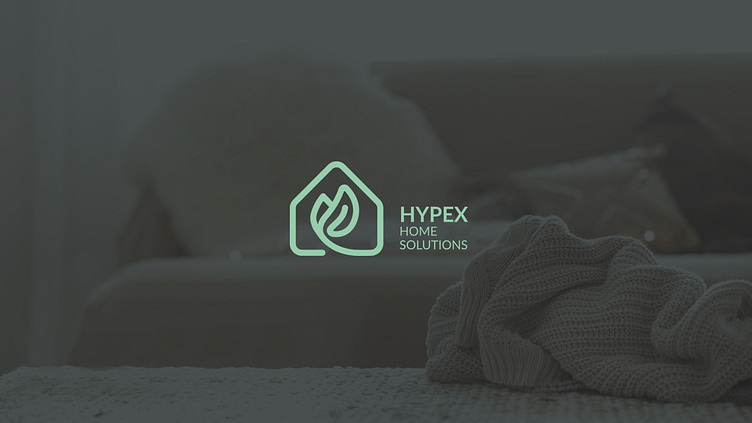
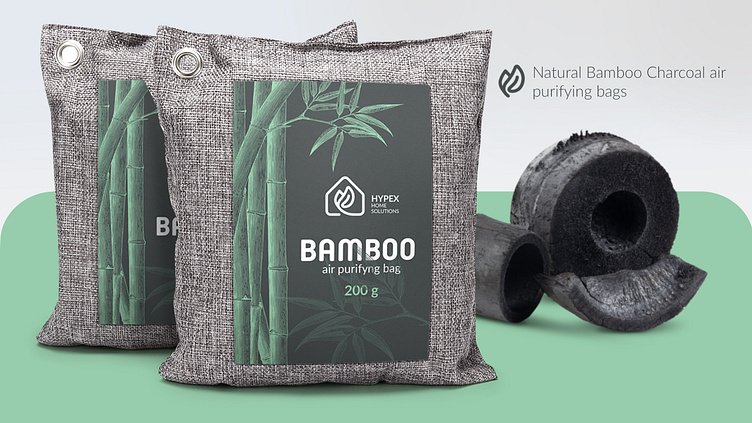
Client. Hypex is a brand that produces products for the home and garden.
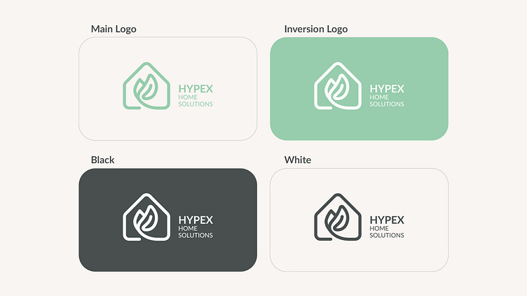
Objective. To contain the concepts of home, ECO, cleanliness and reliability.
Solution. The symbol of the stability of the house and the petal, which is inside. The petal lines are soft and flexible. The house is stable and unshakable. There are no sharp corners in the logo.
The logo conveys the following messages:
- healthy lifestyle;
- simplicity;
- reliability;
- stability;
- safety.
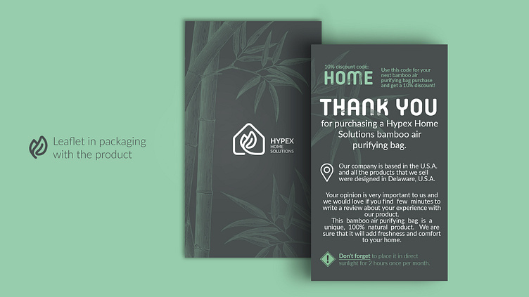
Purpose:
Overcome the wall of user distrust and get the message across:
Hypex is a safe brand of home products.

Need a Logo/Packeging/Brand Identity design?
Get in touch : Unabarva@gmail.com
----------------------------------------------------------------------------------
