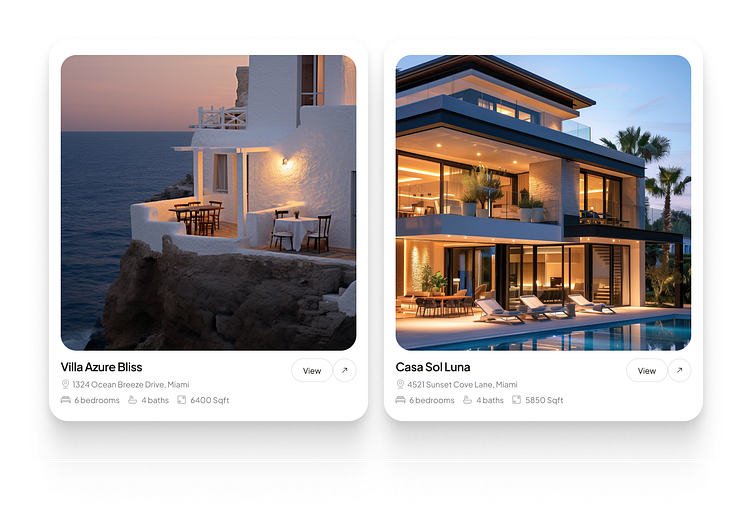
Features Property Cards
Elevated Real Estate Cards – A UX/UI Breakdown 🏡✨
Here’s a design concept for showcasing luxury properties that blends elegance with usability. Let’s break it down:
1. Visual Hierarchy Done Right:
The properties take center stage with vibrant, high-quality images. The focus is on the lifestyle they represent—peaceful seaside bliss and modern luxury.
2. Clean Typography:
Key details like the property name, address, and specs (bedrooms, bathrooms, and square footage) are displayed in a clear, easy-to-read format. The choice of font and spacing ensures clarity without overwhelming the user.
3. Actionable Design:
Simple and intuitive call-to-actions like “View” keep the user experience streamlined, encouraging further interaction.
4. Consistent Iconography:
Icons for bedrooms, bathrooms, and square footage maintain visual consistency while providing quick, digestible info.
5. Rounded Card Edges & Shadows:
The soft corners and subtle shadows create a modern, approachable feel, making the design aesthetically pleasing and user-friendly.
Follow us on socials for updates! 👇
LinkedIn | Instagram | Website
📩 Have a project in mind? Let’s talk! Contact us at hello@brightstudios.agency.
Let’s design something extraordinary. 💡
