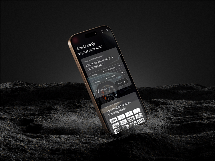
Home page design proposal for a car dealer
Hi Everyone 👋🏻
Excited to share our latest design project! 🚀
This home page design proposal for a dealer of new and used cars focuses on achieving maximum clarity and readability. Our goal was to provide users with easy access to all the necessary information while drawing attention to key elements.We experimented with a subdued color palette based on white, black, and shades of gray, creating a neat and elegant look for the entire site.
The brand color was strategically used to highlight key elements like action buttons and important headlines. This approach helps users quickly take steps toward buying their dream car or accessing the client’s services.
Interactive sections are clearly highlighted, allowing users to navigate the site content effortlessly.
Take a look and let us know what you think—your feedback is always welcome! 💬
Share your challenges with us - together we will create solutions to attract users!
Contact us now 💬hello@kreatik.pl
Let’s connect:


