Website Design for a Company
Hi, dribblers 😀!
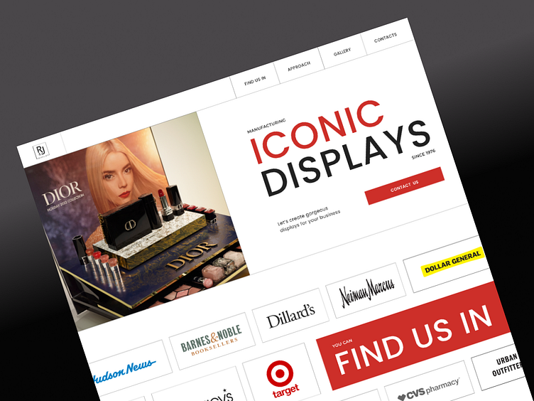
The landing is for the company in USA, specializing in manufacturing displays for well-known brands.
I used a minimalist layout with bold typography, contrast colours and structured grids to showcase its modern products and services.
Altogether, the design emphasizes a modern and premium aesthetic, reflecting the brand's vibe.
Thank You for Visiting!
Have any thoughts on this? Don't hesitate to give your feedback!
Interested in Collaborating?
Let's discuss your next project!
Feel free to text me, I'm available for a new projects:
For quick inquiry feel free to text me on:
More by Olga Konyk View profile
Like

