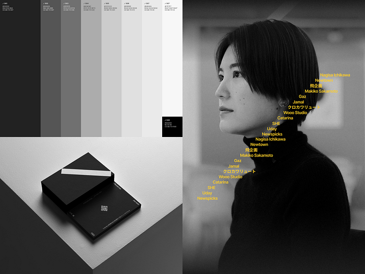
Brand Identity | Next-Gen Site Builder, Studio.Design [4/6]
Memorable, Not Annoying
As a site builder updates their brand, they face a dilemma - how can the brand be recognizable without being overwhelming?
They decided to challenge the idea of a logo, and turn it into a visual language. Continue reading and see how’s that possible.
Made it this far? Give this a quick Like!
Want the full story?
---
Experience how Japanese aesthetics shape a site builder that’s faster and more intuitive for 500,000+ designers.
Try for free
Get help starting
Twitter (X) | Behance | Dribbble | Instagram | Discord | YouTube
---
Art Direction: Alvaro Arregui from Nuevo.Tokyo™ | Joe Ishii from Studio.Design
Production: Tomasz Mazurczak
Operations: Jack Park
Marketing: Kelvin Ha
More by Studio.Design View profile
Like


