Parking Slot - Parkit
ParkIt
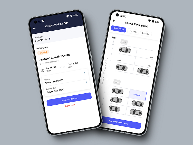
ParkIt is a user-centered app designed to help you easily book a parking slot in a short amount of time. It provides detailed information about each facility and guides you through the booking process effectively.
The Problem
With many employees returning to work from the office full-time and in a hybrid mode, they will be seeking parking slots within their office block. All employee should be able to book parking for their car. Your company is looking to you for some design expertise. Design the parking booking experience to be used by all employees seeking to park their vehicles in the different parking slots within the office block. Employees can check availability, and book and cancel a parking slot.
Role
Solo project.
I conducted user research, developed insights, and created high-fidelity solutions.
Objectives
The goals of this project were simple: to allow employees to check availability and book and cancel parking slots.
Assumptions
It is assumed that the parking slot app will have a brand name, and the PARK IT logo will serve as a placeholder. The application will be used by employees within the building premises, which will be the primary focus of the design.
User-Centered Design
User-Centered Design (UCD) is an iterative design process in which I focus on the users and their needs in each phase of the design process. In UCD, I involve users throughout the design process via a variety of research and design techniques, to create highly usable and accessible products for them.
Design Strategy
Design Strategy is a term used to describe the nexus between corporate strategy and design thinking. Corporate strategy is a traditional method that businesses and other similar entities use to identify, plan, and achieve their long-term objective and goals.
Design Thinking is a methodology that provides a solution-based approach to solving problems by engaging end users.
Business Goal – Hassle Parking Slot solution with advanced for end users
Target Users – Vehicle owners (Employees)
General Task – Choose a Parking slot, See Available Slot, Book one available for you, Follow up with your booking, Edit booking, Cancel Booking, and View Booking History.
Cross Platform – Mobile Devices (iOS and Android), WebApp
Success Factory – Book a slot in Rush, Cancel
Observation
In this phase, I wanted to learn as much as possible about the end user. I wanted to know the problems users are having with the application and how best I could make their experience better. Before redesigning the application, I wanted to make sure that I understood the strengths and weaknesses of the design.
Ideation
From the observations I made in the first phase - research, I brainstormed ideas based on what I learned. I stay focused on the human-centered design process while generating ideas.
Persona
To capture user needs and requirements, I created these a persona.
Bridgit Buddy – 27 Years – Marketing Strategist – Nairobi, Kenya
Behaviour & Characteristics
Digital Savvy Travels a lot for fun.
Goal/Needs
To avoid long queues at the spot.
To spend less time when booking.
To avoid unrestricted tariffs.
Pain Points/Frustrations
Parking lots sometimes are empty, yet you cannot park.
Overcrowded parking spots.
One cannot follow up on the booking progress.
Too much time spent when booking
Design and Implementation
User-flow diagram
As per the above user story, I have created a user flow that starts from the splash screen, then moves from the login page to the homepage, profile, booking parking slot, and canceling the session. My focus is to show the homepage i.e.. user can check availability, book and cancel a parking slot
Sketches
Sketches Using pencil and paper, I fleshed out ideas on the layout and elements of each screen. Throughout this process, I put in mind the pain points uncovered during the research, as well as, insights from the competitor analysis. Doing this helped with quickly iterating several sketches, without committing too much time and energy to one idea.
Wireframes
After several sketches and iterations, I proceeded to Figma to create the low-fidelity prototypes of the app screens with some actual information to make room for usability testing with users. A quick usability test revealed areas of the design, which required some corrections. These changes are largely reflected in the high-fidelity designs.
High Fidelity Designs
I designed all the high-fidelity designs of the app using Figma. I will be presenting three screens, and then sharing the workspace link.
Testing
Success and Metrics
The registered number of users in the platform. Number of completed bookings by the user before the end of the day. User's feedback about the application. Number of created, successfully tracked, and completed bookings through the application
Prototype
A high-fidelity prototype of the app created in Figma is found in the link below: https://www.figma.com/proto/PY6YoJyil1z4JfFEmZ35hE/Booking-Parking-Slot?page id=0%3A1&node-id=1%3A2&viewport=54%2C640%2C1.08&scaling=scale-down


