iOS Spotify Rework
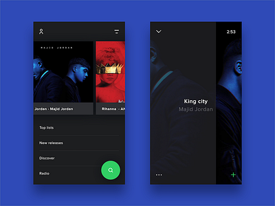
So I tried to strip it down and make it as minimalistic as I could.
Profile/settings up to the left, and then my music up to the right and search in a fab.
About the player screen, I’m a fan of how Soundcloud did with their player. Swipe left and right to previous and next song, drag to fast forward, klick in the middle to pause. etc.
More button to the left and add to playlist/favorites to the right.
Hope you’ll like it guys!
More by Viktor Hofte View profile
Like

