Product Card - UI#1
Behind the Design: Matcha Donut Product Card
Crafting Trust and Temptation This playful and vibrant product card is designed to capture attention, build trust, and drive action. Here's the thought process behind the design:
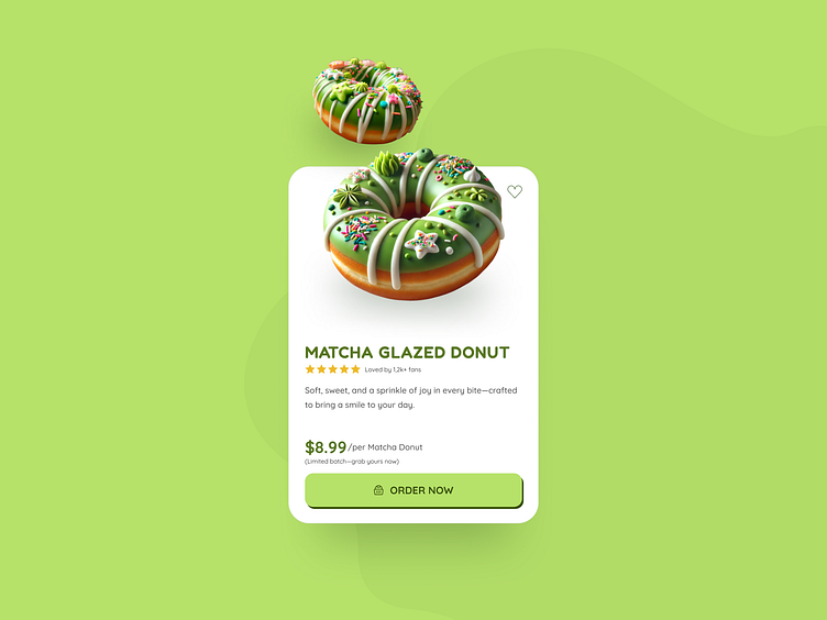
Social Proof for Credibility Featuring a 5-star rating alongside the message "Loved by 1.2k+ donut fans" instantly reassures customers of the product's quality and popularity, leveraging the power of social proof to build trust.
Scarcity to Create Urgency The message "Limited batch—grab yours now!" encourages immediate action by tapping into FOMO (fear of missing out), a proven psychological driver for conversions.
Mouthwatering Visuals A high-quality image of the Matcha Donut takes center stage, showcasing the vibrant green icing and whimsical toppings to spark a craving at first glance.
Bold and Playful Typography Fonts like Fredoka and Quicksand add a friendly, fun vibe while keeping the text legible and engaging for users.
Action-Oriented CTA A bright, clickable button like "Order Now" ensures a seamless path to purchase, strategically placed to stand out against the green matcha theme.
Matcha-Themed Color Palette A harmonious mix of green tones with soft neutrals evokes freshness and aligns with the matcha aesthetic, while accent colors in the CTA add vibrancy.
This design isn't just about aesthetics—it's about crafting an experience that resonates with users, builds trust, and gently guides them to make that sweet purchase. 🍩✨
What do you think? Would you grab one of these matcha delights?
